Stock trading relies heavily on analysis, and one of the most fundamental tools in any trader’s arsenal is the technical chart. These charts allow traders to interpret historical data and predict future price movements based on patterns and trends. Understanding the different types of charts and how to use them effectively is essential for both novice and seasoned traders.
In this guide, we’ll cover the most popular types of technical charts, their advantages, disadvantages, and practical examples of how they are used in stock trading. By the end of this article, you’ll have a comprehensive understanding of how to leverage these tools to improve your trading strategies.
What Are Technical Charts?

Technical charts are graphical representations of a stock’s price or other market data over a specific period. They are used to:
- Visualize market trends.
- Identify potential entry and exit points.
- Recognize recurring patterns.
- Analyze market psychology through price movement.
Charts are customizable based on the timeframe (e.g., intraday, daily, weekly) and type of data displayed (e.g., candlestick, line, bar).
Types of Technical Charts
1. Line Charts
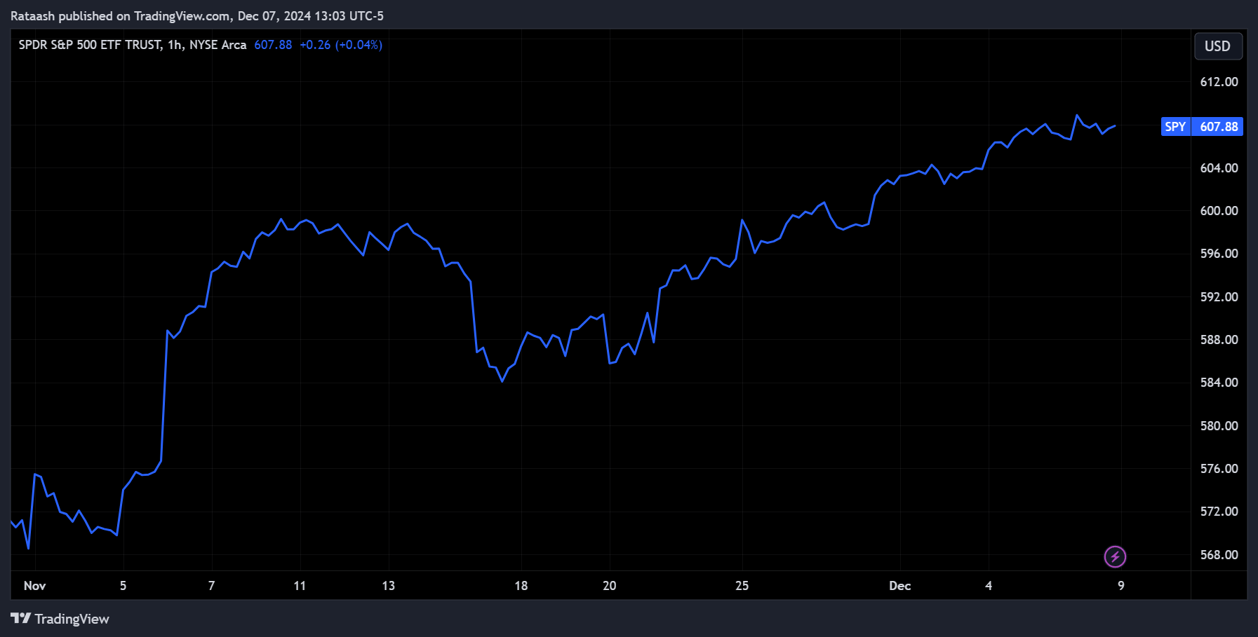
What Are Line Charts?
A line chart is the simplest type of chart, displaying a single line connecting the closing prices of a stock over a specific timeframe.
Key Features:
- Focuses on closing prices, which many traders consider the most important data point.
- Easy to read and ideal for beginners.
- Used to identify overall trends without distraction from intraday noise.
Advantages:
- Simplicity and clarity.
- Ideal for observing long-term trends.
Disadvantages:
- Lacks detail about intraday price movements (open, high, low).
Example:
If a stock closes at $100, $105, and $110 over three days, the line chart will display these points connected by straight lines.
2. Bar Charts
What Are Bar Charts?
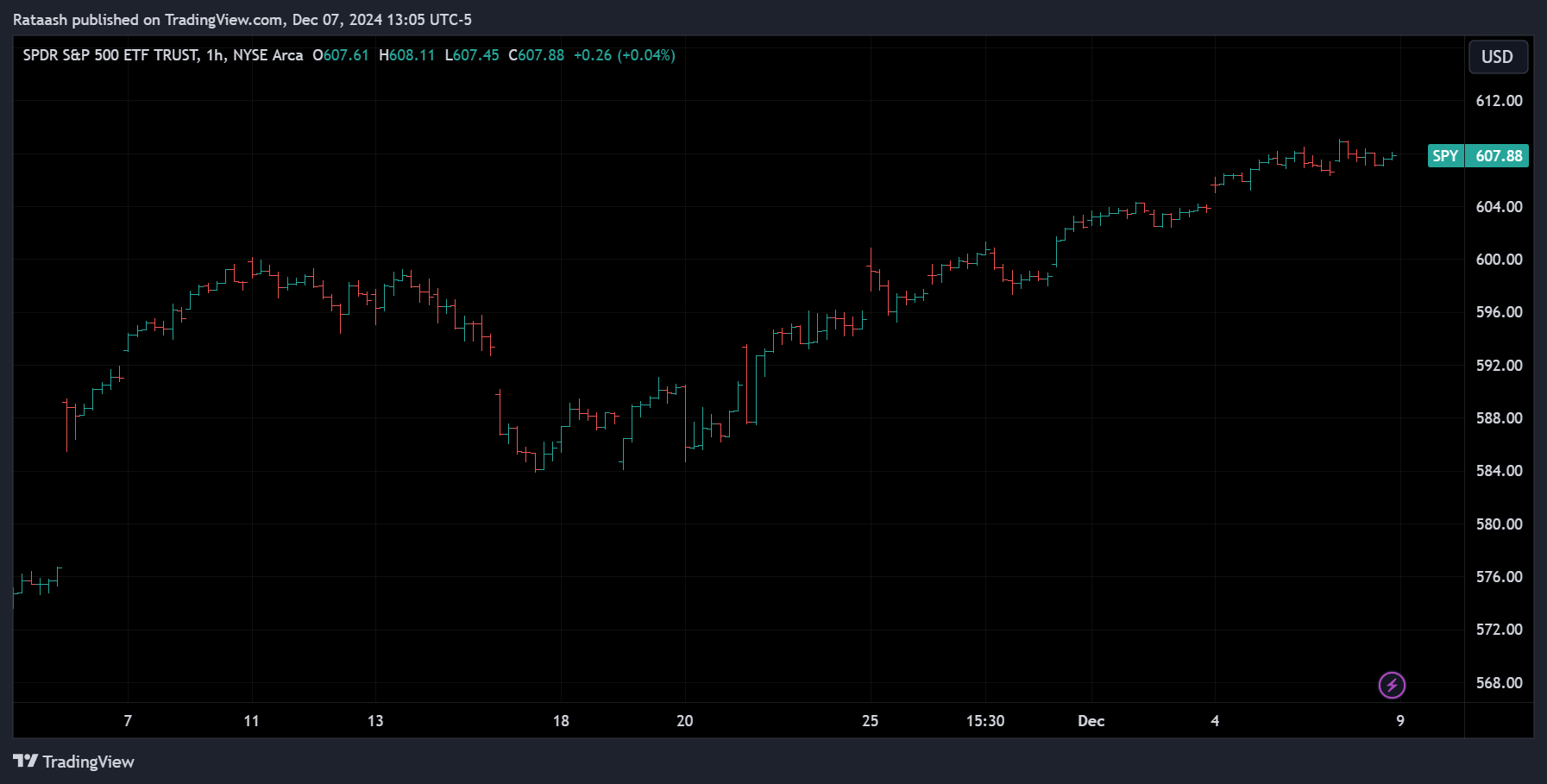
Bar charts provide more information than line charts, showing the open, high, low, and close (OHLC) prices for each time period.
Key Features:
- Each bar represents one time period.
- The top of the bar shows the highest price, and the bottom shows the lowest price.
- A small horizontal tick on the left indicates the opening price, while one on the right shows the closing price.
Advantages:
- Provides detailed information.
- Useful for identifying patterns like reversals and breakouts.
Disadvantages:
- Can appear cluttered for beginners.
- Requires practice to interpret effectively.
Example:
For a day where a stock opened at $100, hit a high of $110, a low of $95, and closed at $108, the bar chart will reflect all these points.
3. Candlestick Charts
What Are Candlestick Charts?
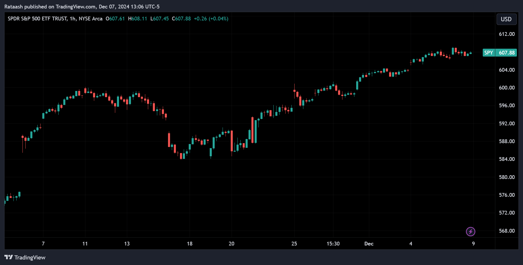
Candlestick charts are similar to bar charts but use colorful “candles” to represent OHLC data, making them visually intuitive.
Key Features:
- The body of the candle shows the range between the open and close prices.
- Wicks or shadows extend from the candle body to represent the high and low prices.
- Colors indicate market sentiment (e.g., green for bullish, red for bearish).
Advantages:
- Combines detail with clarity.
- Excellent for identifying market psychology.
- Supports advanced analysis with candlestick patterns like Doji, Hammer, and Shooting Star.
Disadvantages:
- May overwhelm beginners with too much information.
Example:
A green candle with a body between $100 and $110 and wicks extending to $95 and $115 shows bullish activity for the day.
4. Point-and-Figure Charts
What Are Point-and-Figure Charts?
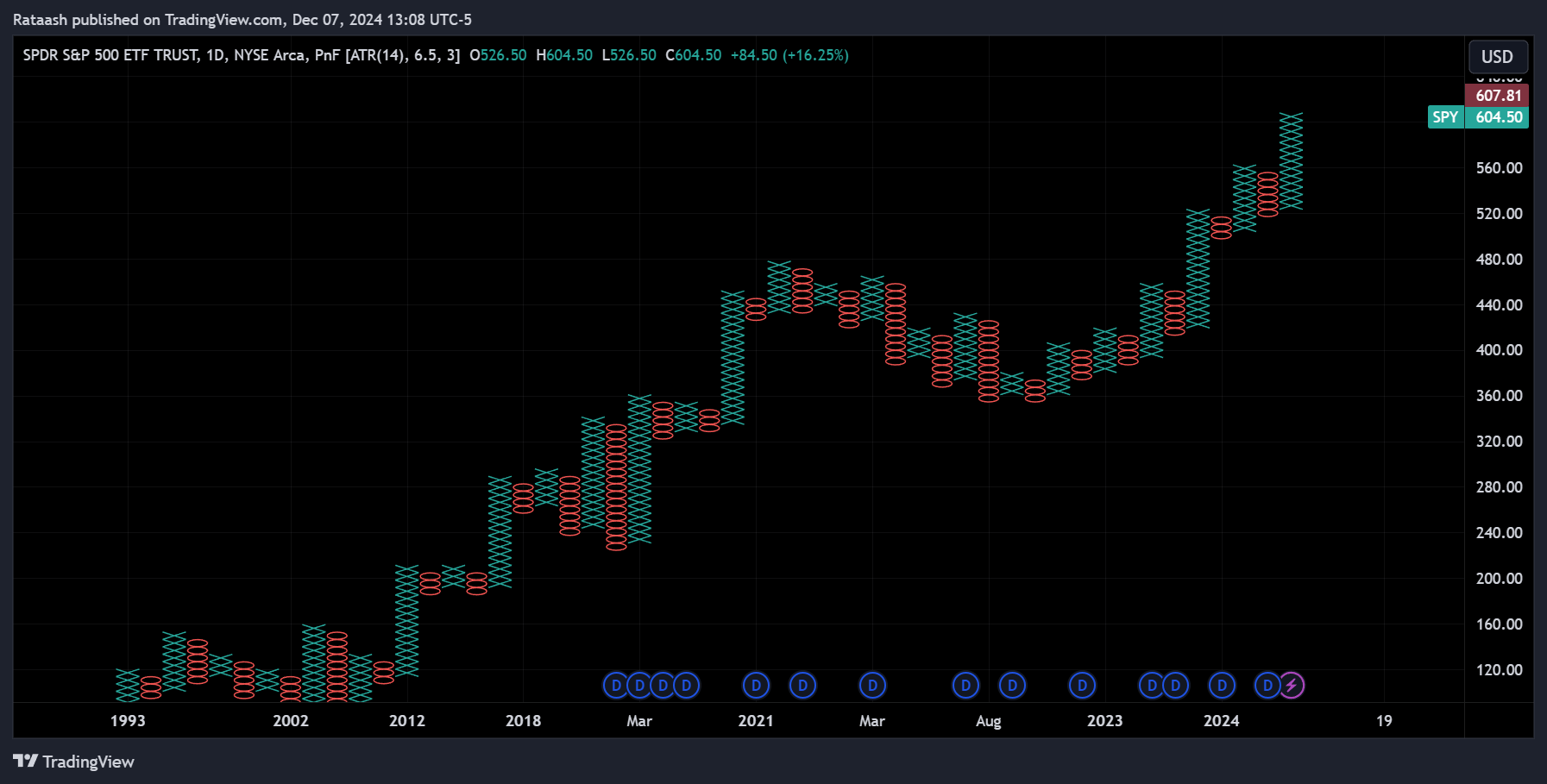
Point-and-Figure (P&F) charts ignore time and focus solely on price movements, using Xs and Os to represent upward and downward movements, respectively.
Key Features:
- Emphasizes price trends without regard to time.
- Xs indicate rising prices, and Os indicate falling prices.
- A new column starts when the price reverses by a specified amount.
Advantages:
- Filters out noise and highlights key trends.
- Ideal for determining support and resistance levels.
Disadvantages:
- Lacks time context.
- Not commonly used in real-time trading.
Example:
If a stock rises from $100 to $105 and then falls to $97, the P&F chart will show a column of Xs for the upward movement and a new column of Os for the downward movement.
5. Renko Charts
What Are Renko Charts?
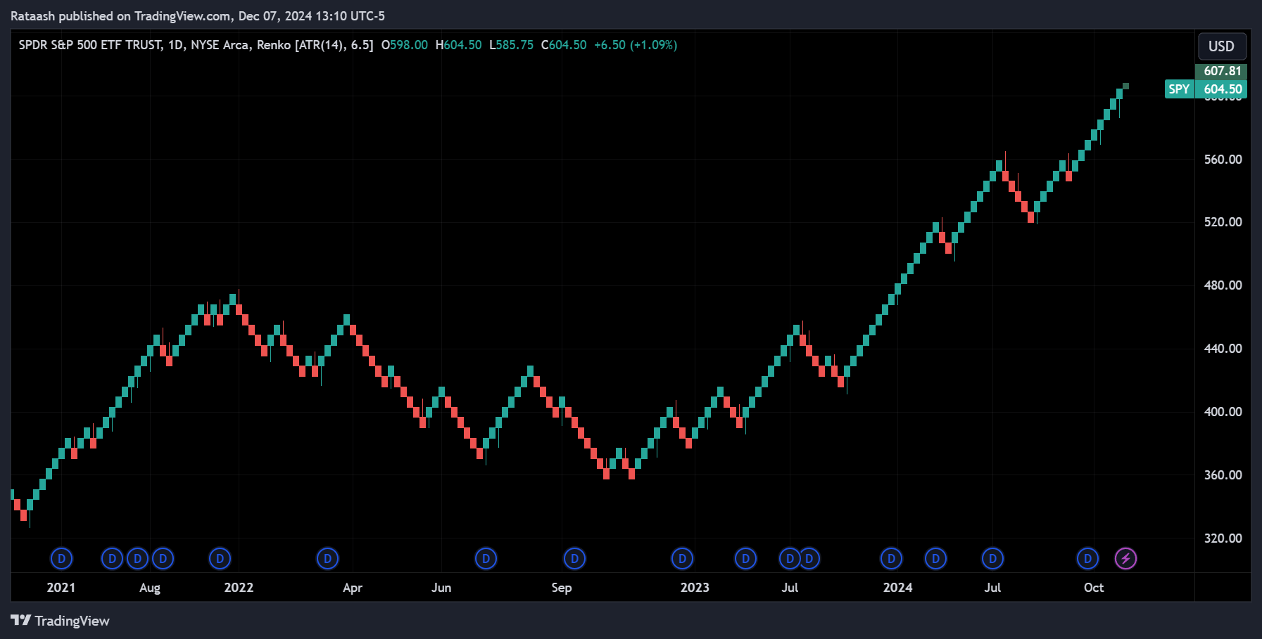
Renko charts are constructed using blocks (or bricks) of a fixed size, representing price movement without considering time.
Key Features:
- A new brick is added when the price moves by a set amount.
- Focuses on significant price changes and ignores minor fluctuations.
Advantages:
- Excellent for identifying trends.
- Reduces noise.
Disadvantages:
- Ignores time.
- May lag in fast-moving markets.
Example:
If the brick size is $5 and the stock moves from $100 to $115, three bricks are added to the chart.
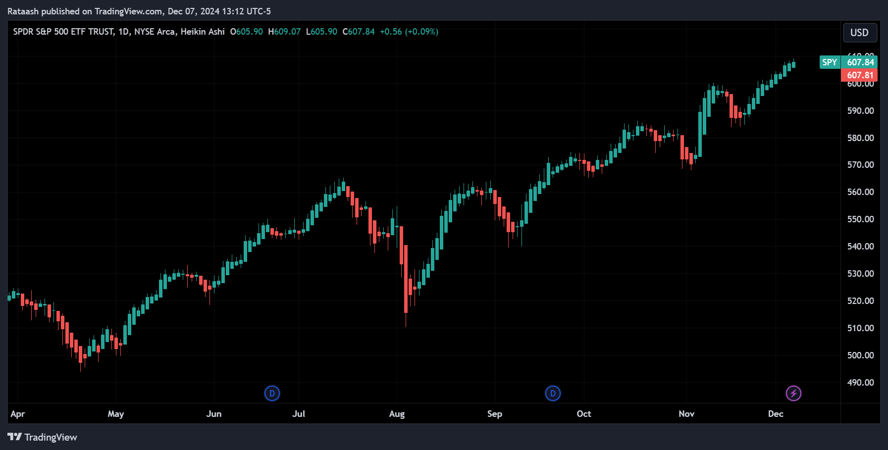
6. Heikin-Ashi Charts
What Are Heikin-Ashi Charts?
Heikin-Ashi (Japanese for “average bar”) charts modify candlesticks to smooth price data, making trends easier to spot.
Key Features:
- Calculates each candle using averages of the current and previous period.
- Reduces market noise and highlights trends.
Advantages:
- Clear trend visualization.
- Useful for spotting reversals.
Disadvantages:
- Delayed signals due to averaging.
Example:
In a bullish trend, Heikin-Ashi candles will show consecutive green candles with minimal wicks.
Choosing the Right Chart Type

The chart type you choose depends on your trading style, goals, and the market conditions:
- Beginner Traders: Start with line charts for simplicity.
- Intraday Traders: Use candlestick or bar charts for detailed analysis.
- Trend Followers: Heikin-Ashi and Renko charts simplify trend identification.
- Pattern Traders: Use Point-and-Figure charts to spot support and resistance levels.
Best Practices for Using Technical Charts
- Combine Chart Types: Use multiple chart types to gain a holistic view of the market.
- Incorporate Indicators: Add technical indicators like Moving Averages or RSI to enhance analysis.
- Adjust Timeframes: Analyze charts over different timeframes to understand short-term and long-term trends.
- Recognize Patterns: Learn common patterns like Head and Shoulders, Double Tops, and Flags.
- Use Support and Resistance: Identify key levels to determine entry and exit points.
Examples of Chart Usage in Trading Strategies
Example 1: Swing Trading with Candlestick Charts
A trader spots a Hammer candlestick pattern at a support level, signaling a potential reversal. They enter a long position, placing a stop-loss below the pattern’s low.
Example 2: Trend Following with Renko Charts
A trader uses Renko charts to identify a bullish trend. They enter a position when a new green brick forms, exiting when a red brick appears.
Common Mistakes to Avoid

- Overloading Charts: Avoid using too many indicators or data points, as this can lead to analysis paralysis.
- Ignoring Context: Analyze charts in the context of broader market trends and news.
- Relying on One Chart Type: Use multiple chart types to validate signals and improve accuracy.
Conclusion
Technical charts are the foundation of stock trading analysis, offering valuable insights into market behavior and helping traders make informed decisions. Each chart type serves a unique purpose, whether it’s identifying trends, analyzing price movements, or spotting key patterns.
Price movements on charts are driven by supply and demand dynamics. When the price increases, it indicates that demand for the asset exceeds its supply. Conversely, a decrease in price implies that the supply is greater than the demand.
If the price is falling, it reflects that more sellers are willing to sell the asset, while fewer buyers are willing to purchase it. On the other hand, if the price is rising, it shows that more people are eager to buy the asset, while fewer sellers are offering to sell. These market principles are essential to understanding chart movements and making better trading decisions.
For the best technical analysis experience, use TradingView, a robust platform with advanced tools and customizable charts. Whether you’re a beginner or a seasoned trader, TradingView’s intuitive interface and vibrant community make it an excellent choice to elevate your trading strategies.
