Trading, whether it’s in stocks, commodities, currencies (forex), or cryptocurrencies, is a pursuit that blends analytical thinking, risk management, and psychological fortitude. As a trader, one of the best ways to assess your performance, refine your strategies, and maintain consistency in your results is by visualizing and measuring your progress.
Two critical elements in understanding how your trading strategies are performing are:
- Equity Curve Analysis – The visual trajectory of your trading account balance (equity) over time.
- Growth Rate – How quickly (or slowly) your capital is increasing, typically measured on an annualized or compounded basis.
In this in-depth article, we’ll break down everything you need to know about equity curve analysis and growth rates in trading. We will explore why they matter, how to calculate them, how to interpret them, and what practical steps you can take to improve them. By the end, you should be equipped with the essential knowledge and actionable insights to make your trading journey more consistent and profitable.
Table of Contents
Understanding Equity Curve Analysis
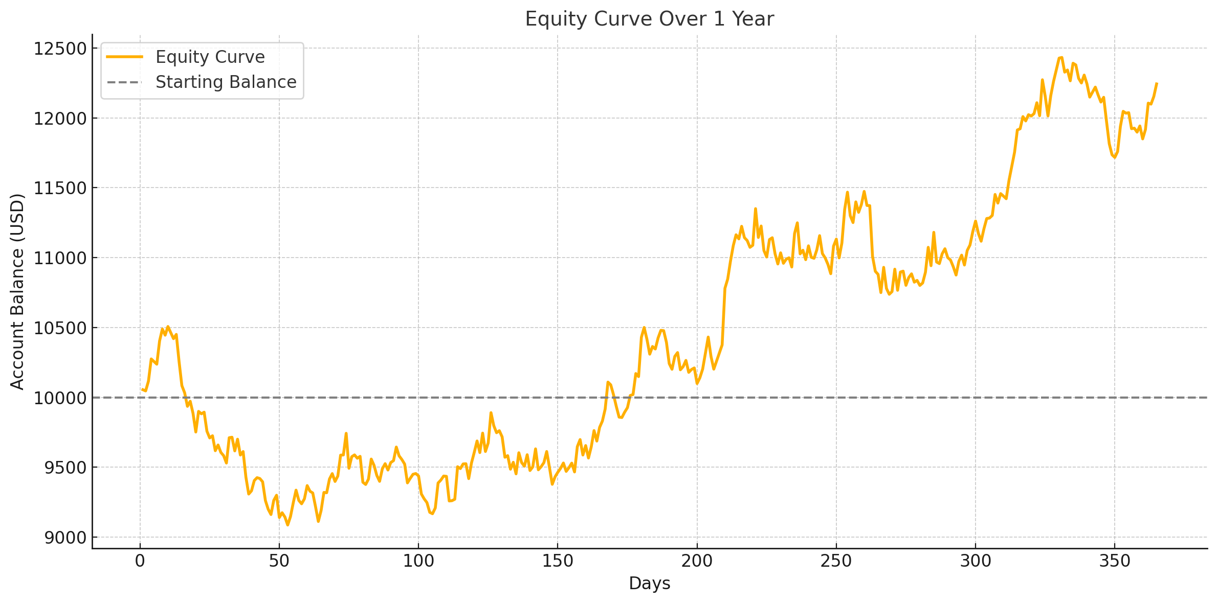
Equity curve analysis is one of the most direct ways to assess your trading performance. It’s effectively the plot of your trading account’s value (equity) over time. Each time you place a trade—whether it’s a win, a loss, or a break-even outcome—that outcome is reflected in the equity curve.
Definition and Importance
- Definition: An equity curve is a graphical representation of the growth (or decline) of your trading account balance over a specified period.
- Importance:
- Performance Tracking: It allows you to see if your trading strategy is performing consistently or if it’s prone to large drawdowns.
- Psychological Insights: A smooth upward-sloping equity curve often helps in maintaining trader confidence, while a choppy or downward-trending curve can lead to emotional trading decisions.
- Risk Assessment: You can identify periods of high volatility and risk in your strategy by analyzing how steeply your equity curve moves up or down.
Key Components of the Equity Curve
- Starting Balance: The initial capital with which you begin trading.
- Net Profit/Loss: The accumulated gains or losses over time, plotted as the account balance.
- Drawdowns: The difference between the peak equity and the subsequent trough; measures the largest drop from a peak.
- Recovery Periods: The time it takes from a drawdown to get back to a new equity high.
- Plateaus: Periods where the equity curve remains flat, indicating either a break-even performance or extremely small fluctuations in either direction.
Common Pitfalls When Reviewing Equity Curves
- Focusing Only on Net Profits: Traders may look at a final figure (e.g., “I gained 20% in six months”) without analyzing the equity curve volatility or drawdowns that occurred along the way.
- Overemphasis on Short-Term Results: A small series of losing trades or a short streak of profits can distort the true performance of a strategy.
- Ignoring Drawdowns: Drawdowns are critical in risk management. A strategy with a 60% profit might still be dangerous if it experiences steep and prolonged drawdowns.
- Lack of Consistency in Sampling: If you only update your equity curve sporadically, you may miss important details about how your strategy responds to different market conditions.
Growth Rate in Trading
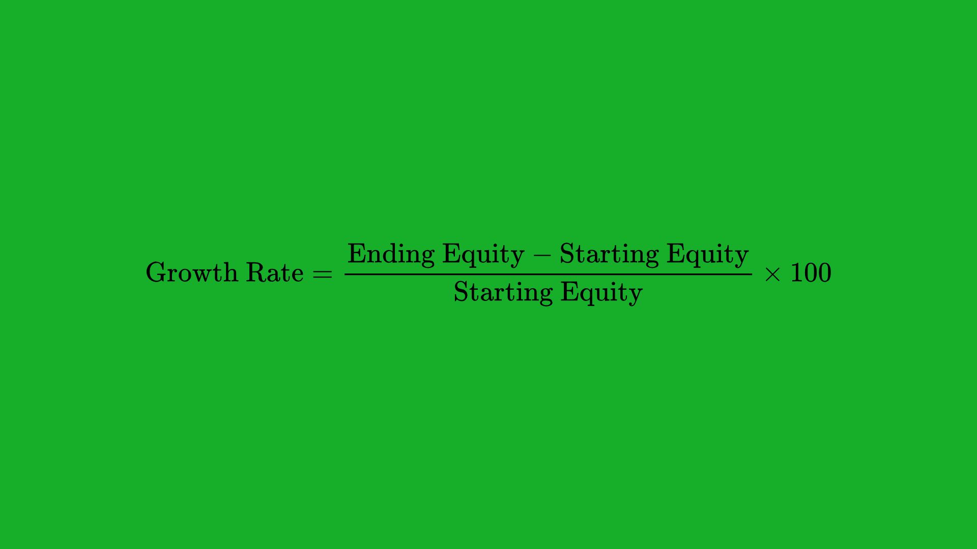
While the equity curve visually represents what’s happening in your account, the growth rate quantifies the speed and manner of your portfolio’s expansion. Growth rate can be computed in several ways, but the two most common are Compound Annual Growth Rate (CAGR) and Annualized Growth Rate (AGR). Understanding these rates helps you plan for future goals, manage risk, and allocate capital more effectively.
Compound Annual Growth Rate (CAGR)
CAGR is a measure of how much your portfolio grows (on average) each year, factoring in the effect of compounding. Essentially, it answers the question: “If my portfolio grew at a steady rate each year, how much would it grow annually to reach my end balance from my initial balance?”
Formula:

Example:
Suppose you started with $10,000 and ended with $20,000 in three years. Then:

This means your account effectively grew by 26% each year on average, compounded annually.
Annualized Growth Rate (AGR)
The Annualized Growth Rate (also referred to as “annualized return”) is slightly different in that it may not factor in the same level of compounding detail, depending on how it’s calculated or reported. However, it’s still a useful metric for comparing returns across different time periods or different investments.
Typical Calculation:

Example:
If you made a 60% total gain over three years, your AGR would be 20% per year. Note that this might differ slightly from CAGR if profits were reinvested and compounded at different intervals.
Simple vs Logarithmic Growth
Growth can be measured in simple (arithmetic) terms or logarithmic terms. In trading contexts, some professional analysts prefer log returns, as these returns are additive over time and provide a clearer picture when combining gains and losses.
- Simple (Arithmetic) Growth: If you gain 10% this year and 10% next year, you add them for a total of 20% (not factoring compounding precisely).
- Logarithmic Growth: Log returns will measure the ratio between your start and end values, making them more appropriate for consistent time-series analysis.
Why Growth Rate Matters
- Performance Benchmarking: Growth rates let you compare your trading results with indices (e.g., S&P 500) or other traders.
- Risk Management: A high growth rate that comes with excessively high risk might not be desirable.
- Capital Planning: Knowing your growth rate helps in deciding whether to scale up capital allocation or to keep your risk low.
- Long-Term Goal Setting: CAGR or AGR gives a realistic view of how your trading capital might expand over 5, 10, or 20 years.
Synergy: Combining Equity Curve Analysis and Growth Rate
On their own, an equity curve and growth rate calculations are informative. However, the real power comes when you combine these two perspectives. The equity curve will show you how you arrived at your current balance, while the growth rate tells you how fast you’re getting there.
Short-Term vs Long-Term Views
- Short-Term: An equity curve might look jagged and volatile in the short term, but the short-term CAGR or AGR might not be very meaningful if it’s only for a few weeks or months.
- Long-Term: Over several months or years, the equity curve will reveal patterns of growth and drawdown, and the CAGR becomes more statistically significant.
Detecting Performance Plateaus
A critical sign to look for when combining these metrics is performance plateaus—periods where your equity curve remains flat. During a plateau, your growth rate will inevitably decline, so a drop in CAGR or annualized returns can signal a need for adjustments, such as:
- Altering your trading strategy or diversifying into new markets.
- Tweaking your risk management approach (e.g., adjusting position sizes).
- Reevaluating your market analysis methods (technical vs. fundamental vs. quantitative).
Volatility and Risk Management
If your equity curve is extremely volatile, your growth rate might fluctuate wildly from month to month. While a high monthly gain might boost your growth rate, a subsequent large drawdown can erase months of profits. By analyzing both equity curve smoothness (or lack thereof) and the variance of your growth rates, you can gauge if your trading style is taking on too much risk or if it remains within acceptable drawdown thresholds.
Tools and Techniques for Equity Curve and Growth Rate Analysis
You don’t need expensive software or complex systems to visualize your equity curve or calculate your growth rate. Several tools and techniques are available, from spreadsheets to advanced automated platforms.
Manual Calculation and Spreadsheet Techniques
- Spreadsheet Programs: Microsoft Excel, Google Sheets, and LibreOffice Calc allow you to:
- Keep a trading log with columns for date, trade entry, trade exit, profit/loss, and cumulative balance.
- Plot these cumulative balances to form your equity curve.
- Use built-in formulas (such as
XIRRin Excel) to compute CAGR or annualized returns.
- Manual Entries: You can record each trade’s outcome and update your equity curve daily or weekly. This approach fosters discipline and deeper understanding, as you see the effect of every trade on your account.
Automated Trading Platforms and Charting Tools
- MetaTrader (MT4/MT5): Popular among forex traders, it automatically tracks your account balance, creates performance reports, and sometimes includes built-in equity curve analyses.
- TradingView: While more focused on charting price action, you can create scripts (Pine Script) for backtesting a strategy and generating performance metrics, including an equity curve.
- Brokerage Dashboards: Many modern brokerages provide daily or monthly statements illustrating your trading activity, total P/L, and sometimes an equity curve.
Tracking Real-Time vs Historical Performance
- Real-Time: Real-time monitoring is crucial for active traders. By keeping tabs on daily or weekly updates to your equity curve, you can quickly spot anomalies or large deviations from expected performance.
- Historical: Examining past performance over months or years can help identify persistent patterns or cyclical behaviors that might repeat in the future.
Factors That Impact Equity Curves and Growth

A well-designed equity curve does not exist in isolation; it’s influenced by multiple factors including strategies, risk management, and external market conditions. Understanding these influences helps traders refine their approach to achieve a steadier and more predictable equity trajectory.
Trading Strategies and Their Influence
- Trend-Following Strategies: These tend to produce smoother upward equity curves in trending markets, but might see prolonged drawdowns during sideways or volatile market phases.
- Mean-Reversion Strategies: Often produce consistent small gains, yet can suffer large drawdowns if the market transitions into a strong trend that deviates significantly from its mean.
- Scalping: Very short-term strategies that take advantage of small price movements. Equity curves can appear smoother but might have lots of tiny profits and occasional big losses if trades go wrong.
- Swing Trading: Captures multi-day or multi-week price movements. Drawdowns can be moderate, but also so can the monthly growth, depending on how effectively trades are managed.
Risk Management Practices
- Position Sizing: How much capital you allocate to each trade can drastically change the shape of your equity curve. Aggressive sizing can lead to big ups and downs; conservative sizing can lead to steadier gains but potentially slower growth.
- Stop-Loss Placement: Effective stop-loss rules can prevent small losses from becoming catastrophic drawdowns that drag your equity curve down significantly.
- Risk-Reward Ratios: Strategies that consistently aim for a certain ratio (e.g., 2:1 reward-to-risk) can help in smoother equity curve growth, provided the strategy’s win rate supports it.
- Leverage: High leverage can magnify returns but also intensifies losses, leading to sharper equity curve swings.
Market Conditions and Volatility
- Bullish vs. Bearish Markets: A bullish market can mask flaws in a trading strategy by boosting equity naturally, whereas a bearish market might expose weaknesses.
- Volatile vs. Low-Volatility Environments: High volatility can lead to larger but riskier gains and losses, whereas low volatility markets might produce slower yet steadier growth.
- Economic and Political Events: Major announcements such as central bank rate changes, geopolitical tensions, or corporate earnings can cause sudden shifts in your equity curve.
Position Sizing and Portfolio Diversification
- Diversification Across Assets: Spreading capital across different markets (stocks, bonds, forex, commodities, cryptocurrencies) can help stabilize your overall equity curve by reducing reliance on a single source of returns.
- Correlation Management: Even if you diversify, your assets might be highly correlated, which can reduce the benefits of diversification. Monitoring and managing correlation is key to a healthier equity curve.
- Sector-Specific vs. Multi-Sector Exposure: If you only trade tech stocks, your performance might be heavily influenced by the tech sector’s momentum. Spreading investments across different sectors can lead to a smoother overall curve.
Visualizations and Interpretations
Having the data is one thing; presenting it in a clear, actionable way is another. Visualizing your trading performance allows you to see trends, spot anomalies, and make more informed decisions.
Line Charts
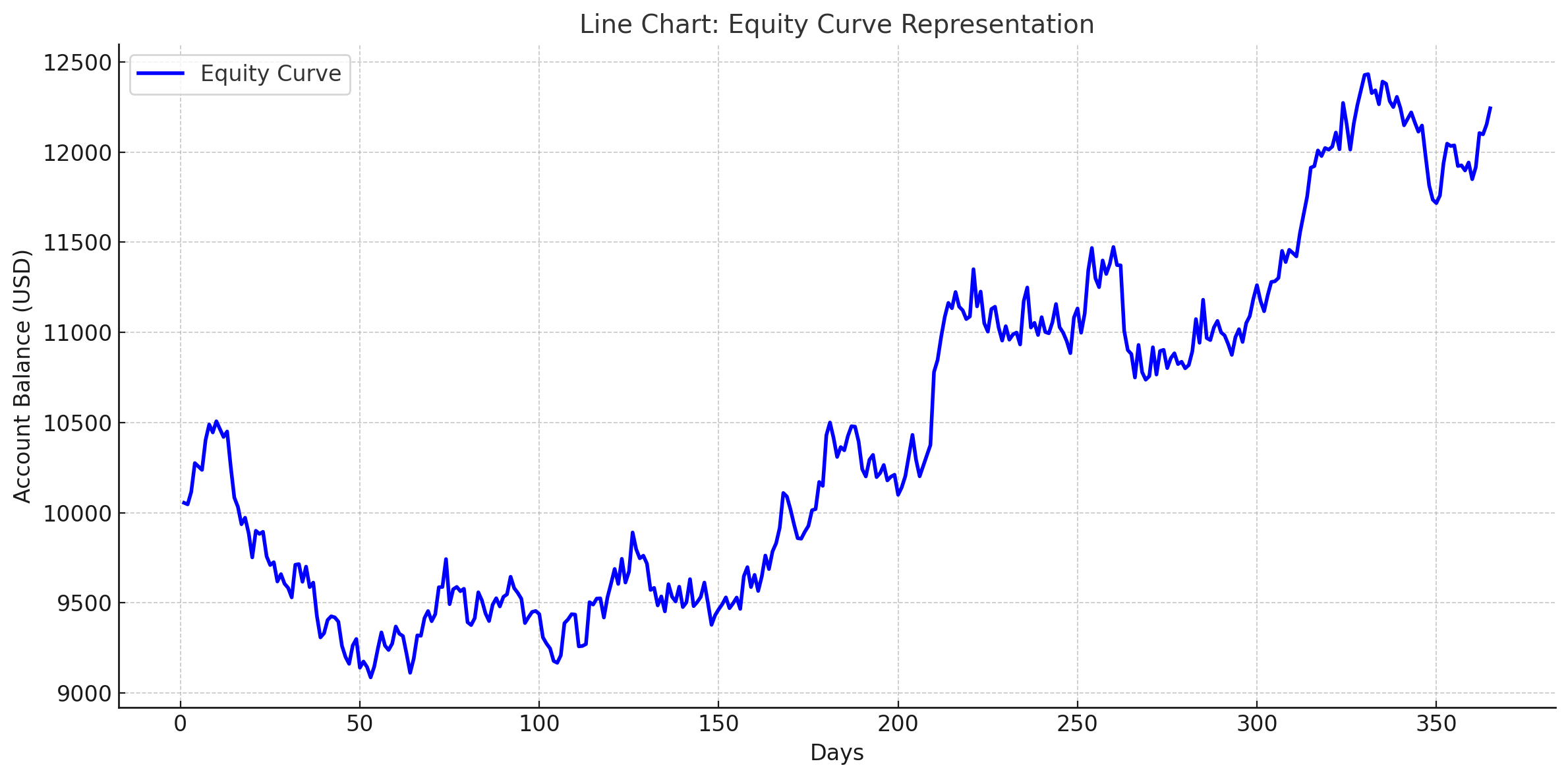
- Most Common Equity Curve Representation: Simply plot the cumulative account balance (y-axis) over time (x-axis).
- Pros: Easy to interpret overall trends, identify drawdowns, and track new high-water marks.
- Cons: May mask large intraday fluctuations if data is recorded only on a daily or weekly basis.
Bar Charts and Histograms
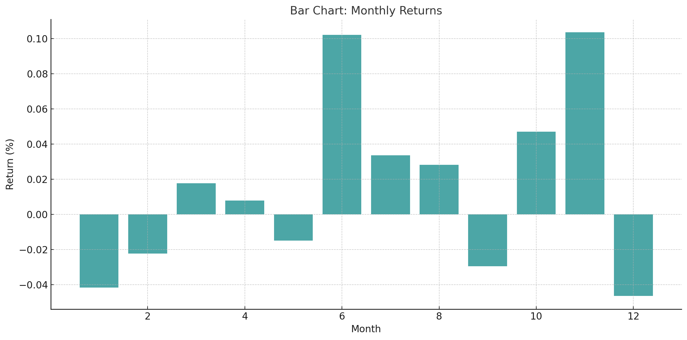
- Bar Charts: Can display monthly (or weekly) returns as discrete bars. Helps identify how each period contributed to overall growth.
- Histograms: Useful for showing the distribution of returns (win vs. loss sizes, frequency of certain profit/loss ranges).
Drawdown Charts
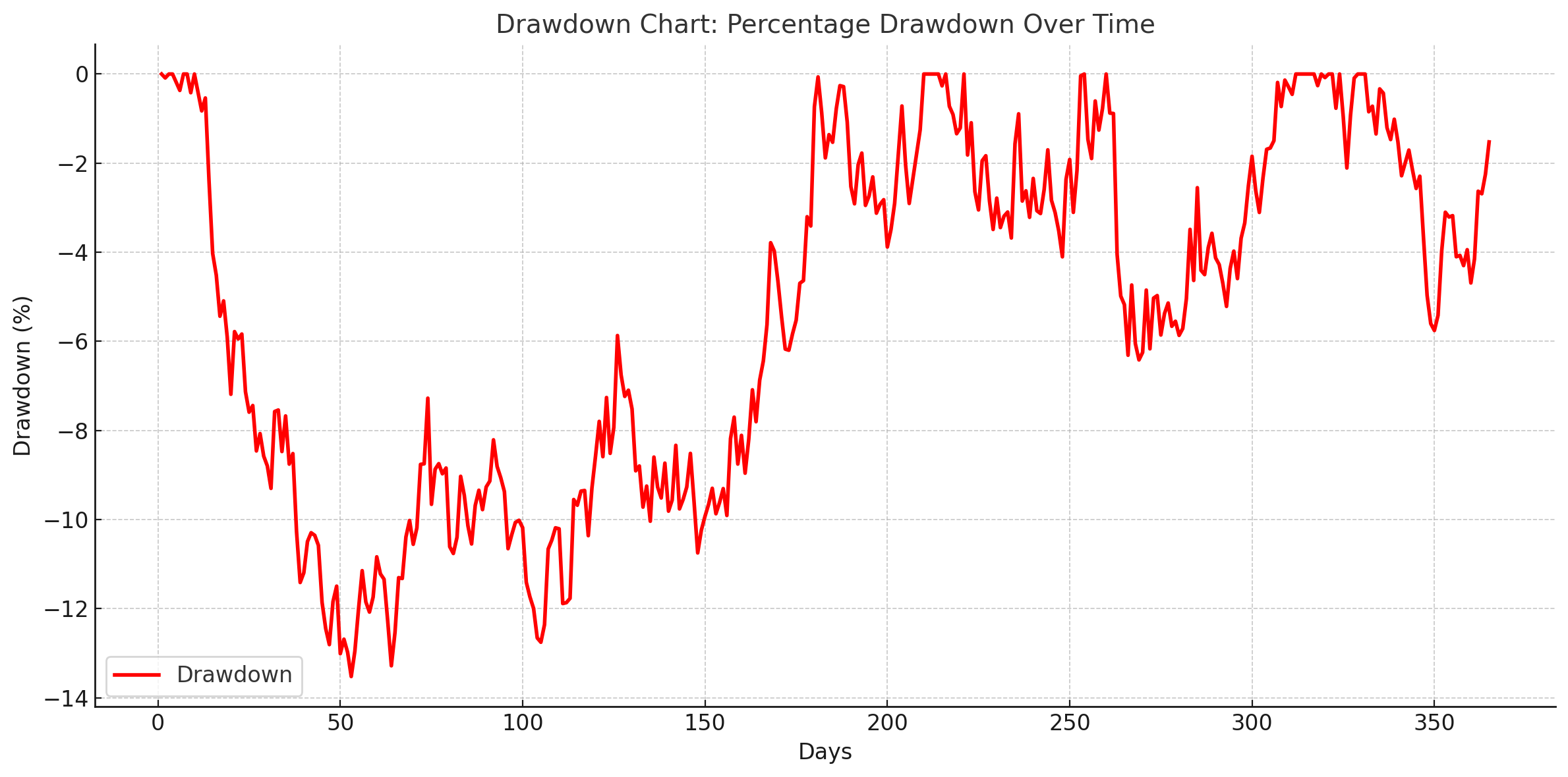
- Definition: A drawdown chart plots the percentage or monetary drawdown from an equity peak over time.
- Purpose: To highlight risk and the intensity of losses. A separate drawdown chart can be eye-opening, showing how long and how deep equity dips have been.
Heat Maps
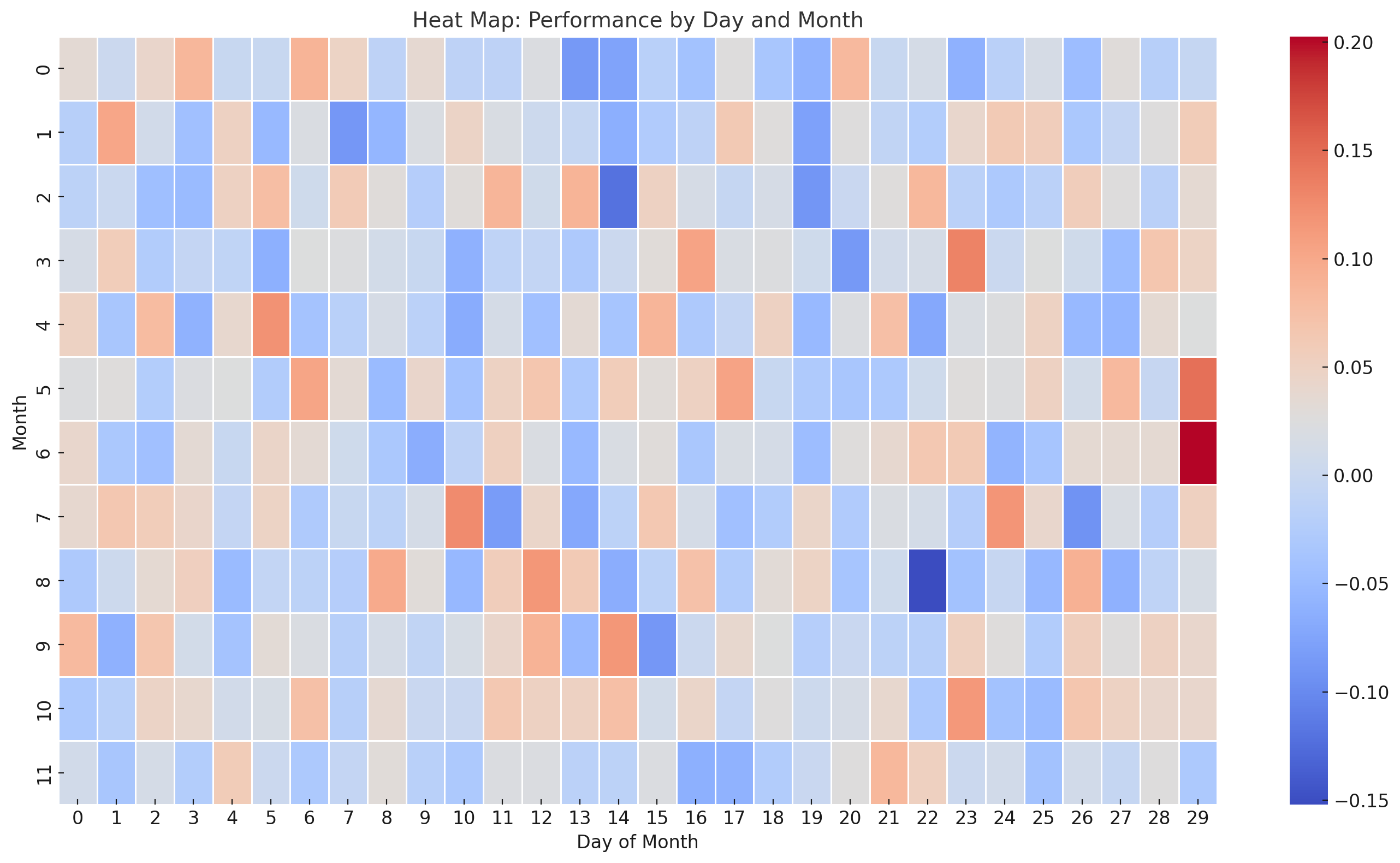
- Heat Maps: Often used in more advanced analytics to visualize multiple assets or multiple strategies. Each cell in a heat map might represent a specific day, week, or month’s performance, color-coded by gain/loss magnitude.
- Interpretation: Quickly see clusters of strong or weak performance, which can correlate with certain market conditions.
Best Practices to Improve Equity Curve and Growth Rate
Now that you understand how equity curves and growth rates work, how can you make yours more stable, consistent, and steadily upward?
Optimize Your Risk-Reward Profile
- Focus on Trades with Favorable R/R Ratios: This means you aim to gain more on your winning trades than you lose on your losing trades.
- Combine with High Win Rate (If Possible): While not always easy, pairing a high win rate with a solid R/R ratio can produce a very stable equity curve.
Focus on Consistency Over Large Wins
- Smooth vs. Spiky Equity Curves: A strategy that yields small, consistent gains and moderate drawdowns can outperform a high-risk strategy prone to boom-bust cycles.
- Lock in Small Profits: If your analysis suggests a trade’s momentum is waning, consider partially locking in profits rather than always aiming for the full target.
Leverage Technology for Better Analysis
- Algorithmic Trading Systems: These can remove emotional biases and allow for more consistent strategy execution.
- Advanced Data Analytics: Tools that utilize machine learning or AI can help spot patterns in your equity curve that you may miss manually.
- Performance Dashboards: Automated dashboards give real-time feedback on key metrics like drawdown, win rate, profit factor, and monthly growth.
Psychological Preparedness
- Discipline: Stick to your strategy, risk parameters, and stop-loss rules, even during losing streaks.
- Emotional Control: Large drawdowns or rapid losses can lead to revenge trading or panic selling. Having a risk-management plan in place can mitigate these impulses.
- Patience: Sometimes the best move is no move. Waiting for a high-probability setup can preserve capital and keep your equity curve from unnecessary dips.
Diversify Strategy and Asset Classes
- Multiple Trading Strategies: Consider employing more than one strategy (e.g., trend-following + mean reversion) to balance out market fluctuations.
- Assets with Low Correlation: Adding non-correlated assets (like gold or different currency pairs) can smooth out the overall equity curve.
Regular Performance Reviews
- Weekly or Monthly Check-Ins: Assess your equity curve regularly and calculate your growth rate. Doing so helps you catch problematic trends early.
- Annual Reviews: Evaluate your CAGR or annualized returns in conjunction with your largest drawdowns to get a holistic view of performance.
- Adjust, Optimize, Repeat: Trading is not static. Constantly refine your strategies, risk controls, and portfolio allocations based on insights gleaned from your equity curve and growth metrics.
Case Study: Example of Equity Curve and Growth Analysis
To illustrate how all these concepts come together, let’s consider a hypothetical case study of a trader—let’s call her Sarah—who has been trading a swing strategy in equities for one year.
Trading Strategy Background
- Starting Capital: $20,000
- Strategy: A simple swing trading approach that buys high-volume stocks when they break above a key moving average and sells when they drop below that average or reach a trailing stop.
- Position Sizing: 2% risk per trade. She has a stop-loss placed to risk exactly 2% of her account if the trade goes against her.
- Risk-Reward Ratio: Typically aims for a 1.5:1 or 2:1 ratio on each trade, depending on market conditions.
Equity Curve Examination
- Initial Wins (Month 1-2):
- Sarah experiences a quick uptick in her equity curve from $20,000 to $21,500.
- The curve is relatively smooth, with a few small dips on losing trades.
- Market Volatility (Month 3-4):
- A sudden correction in the broader equity market leads to a series of false breakouts.
- Sarah’s equity drops from $21,500 to $19,000, a significant drawdown of around 11.6%. Her equity curve shows a sharp dip during these months.
- Her confidence is tested, but she sticks to her rules, keeps risk at 2%, and accepts several small losses.
- Steady Recovery (Month 5-8):
- The market begins to stabilize and trends upward. Sarah makes a series of profitable trades, gradually climbing back to $22,500.
- The equity curve recovers and surpasses its previous high after two months, illustrating a decent recovery period.
- Plateau (Month 9-10):
- Minimal net change, as Sarah experiences a few wins and losses that essentially cancel each other out. The equity curve flattens around $22,600.
- During this plateau, Sarah re-checks her trade setups, ensuring she’s not forcing trades in non-trending markets.
- Year-End Surge (Month 11-12):
- A strong bullish rally in the market allows Sarah to capitalize on a couple of breakouts. By month 12, her account is at $24,000.
By the end of Year 1, her equity curve shows a moderate but respectable upward trend with a notable drawdown in months 3-4, followed by a steady recovery and a final surge.
Growth Rate Calculation and Insights
- Starting Balance: $20,000
- Final Balance: $24,000
- Time Period: 1 year
CAGR (though it’s just one year, we treat it as an annual figure):

Observations:
- A 20% annual growth rate is a solid performance, especially considering the market turbulence in months 3-4.
- Maximum drawdown was about 11.6% (from $21,500 down to $19,000). This is relatively controlled, suggesting Sarah’s position sizing and stop-loss discipline helped contain losses.
Lessons Learned and Improvements
- Risk Management: Sarah’s disciplined approach to limiting losses to 2% per trade kept her largest drawdown manageable.
- Adaptability: She remained patient during plateau periods, resisting the urge to chase suboptimal setups.
- Future Strategy Refinement: Sarah might experiment with scaling into winners or using a slightly different trailing stop mechanism to capture more gains during strong market moves.
Key Takeaways
- Equity Curves Provide Context: Looking at a final profit percentage without seeing the journey can mask vital information about risk and consistency.
- Growth Rate Quantifies Performance: Metrics like CAGR or annualized returns help you compare your results with benchmarks and set realistic goals.
- Volatility Matters: A wildly fluctuating equity curve might be a sign that your risk management or trading approach is too aggressive.
- Combination Is Powerful: By examining both the shape of your equity curve and your growth rate, you gain a clearer, more holistic view of trading performance.
- Regular Analysis Drives Improvement: Constantly monitoring and refining your strategies based on these metrics can lead to steadier, more profitable results over time.
Conclusion
Achieving consistent success in trading requires more than just picking winning trades—it demands an ongoing, thorough examination of your performance. Equity curve analysis provides a visual record of your account’s balance over time, revealing how smoothly (or erratically) your strategy navigates the market. Growth rate metrics, such as CAGR and annualized returns, quantify how fast your capital is multiplying.
Together, these two perspectives form the bedrock of intelligent trading analysis. By utilizing spreadsheets, automated platforms, and proper risk management practices, you can regularly review and refine your trading approach. Striving for a smooth, gradually ascending equity curve combined with a solid growth rate should be the overarching goal for traders who seek long-term viability and profitability.
As you continue your trading journey, remember to remain adaptable—markets change, and so should your strategies. Keep refining your equity curve analysis, monitoring your growth rate, and incorporating best practices in risk management and strategy diversification. Over time, these measures will help you gain better control over your trading performance and stay aligned with your financial goals.
FAQ: Equity Curve Analysis and Growth Rate in Trading
1. What is an equity curve in trading?
An equity curve is a graphical representation of your trading account balance over time, showing your profits, losses, drawdowns, and overall performance.
2. Why is equity curve analysis important?
It helps traders visualize performance trends, assess risk management, detect drawdowns, and identify areas for improvement in their trading strategy.
3. What is the growth rate in trading?
The growth rate measures how quickly your trading account balance increases over time. Metrics like Compound Annual Growth Rate (CAGR) and Annualized Growth Rate (AGR) quantify this growth.
4. How can I improve my equity curve?
Focus on risk management, consistent position sizing, and strategies with favorable risk-reward ratios. Diversify your portfolio and avoid emotional trading during drawdowns.
5. What tools can I use for equity curve and growth rate analysis?
You can use tools like spreadsheets (Excel, Google Sheets), trading platforms (MetaTrader, TradingView), or automated performance dashboards offered by brokers.
6. What is a drawdown, and why is it significant?
A drawdown is the decline in your account balance from its peak to its lowest point. It’s crucial for measuring the risk and volatility of your trading strategy.
7. How often should I review my equity curve and growth rate?
Review them regularly—weekly or monthly for short-term monitoring and annually for long-term performance analysis. Frequent reviews help you spot patterns and make necessary adjustments.
