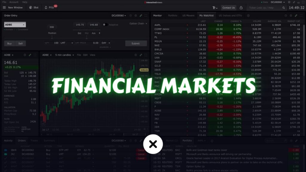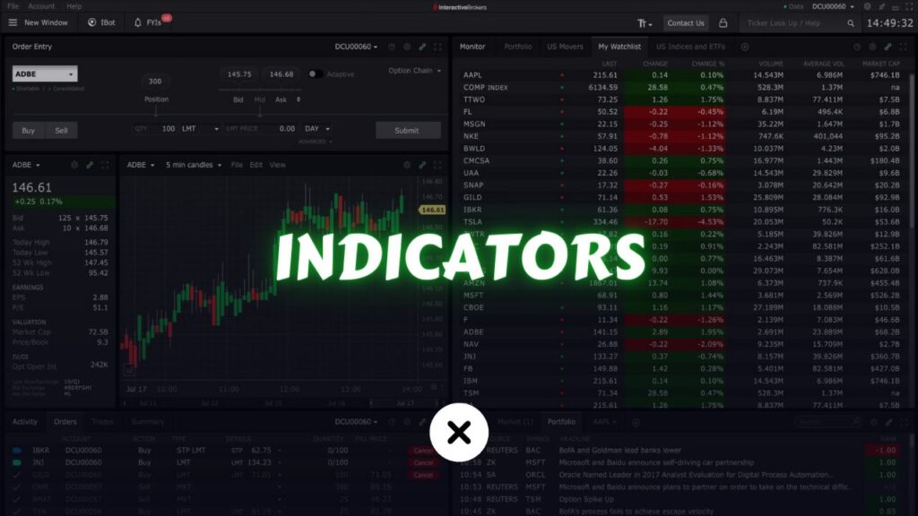
Day trading is a fast-paced approach to the stock market, where traders buy and sell shares within the same trading day to profit from short-term market movements. In an environment where every second matters and price swings can be swift, having an edge is crucial. This is where technical indicators come into play. They act as valuable tools that help traders interpret price action, spot trends, and time entries and exits with greater precision.
While there are various ways to analyze the market, technical indicators focus exclusively on price and volume patterns rather than company fundamentals. They can alert you to momentum shifts, breakout patterns, and potential reversals, enabling you to make more informed decisions rather than trading purely on gut feeling.
In this comprehensive beginner’s guide, we’ll explain the best indicators for day trading stocks, delve into how they work, show you how to use them in different market conditions, and help you understand the importance of combining multiple indicators. By the end of this article, you’ll have a deeper understanding of how indicators can enhance your day trading experience and improve your odds of success.
Table of Contents
Understanding Technical Indicators

What Are Technical Indicators?
Technical indicators are mathematical calculations plotted over price and volume data. Instead of relying on company news or economic reports, these indicators use historical price patterns, trends, and market psychology reflected in the charts. The goal is to turn raw market data into actionable insights, helping traders determine whether a stock might be poised to rally, pull back, or move sideways.
Key Concepts Involving Indicators:
- Price: The most basic element. Indicators often calculate averages, compare current prices to past prices, or identify support/resistance levels.
- Volume: This shows the strength behind a price move. High volume suggests that more traders are involved, potentially making the move more significant.
- Trend: The general direction a stock price moves over time (upward, downward, or sideways). Many indicators aim to identify trends early or confirm their continuation.
- Momentum: Indicators measure how quickly prices are changing. Strong momentum may indicate a powerful trend, while weakening momentum can suggest a possible reversal.
Categories of Technical Indicators
Technical indicators come in various forms, and no single category can address all trading scenarios. Generally, they fall into these main groups:
- Trend-Following Indicators:
These indicators highlight the general direction of the market. They help identify whether you should consider going long (buying) in an uptrend or shorting in a downtrend. Examples include Moving Averages and the Ichimoku Cloud. - Oscillators and Momentum Indicators:
These indicators measure overbought or oversold conditions and gauge the speed of price changes. They are invaluable for spotting potential reversals or confirmation of a trend’s strength. Examples include RSI, Stochastic Oscillator, and MACD. - Volatility Indicators:
Volatility indicators measure the range and speed of price movements. They help you understand market conditions, whether stable and calm or explosive and unpredictable. Bollinger Bands and the Average True Range (ATR) are prime examples. - Volume-Based Indicators:
These focus on the quantity of shares traded and can confirm price movements. If a breakout occurs on high volume, it’s often considered more reliable. On-Balance Volume (OBV) and Volume-Weighted Average Price (VWAP) are commonly used.
Best Indicators for Day Trading Stocks: A Detailed Look
Moving Averages (MA & EMA)
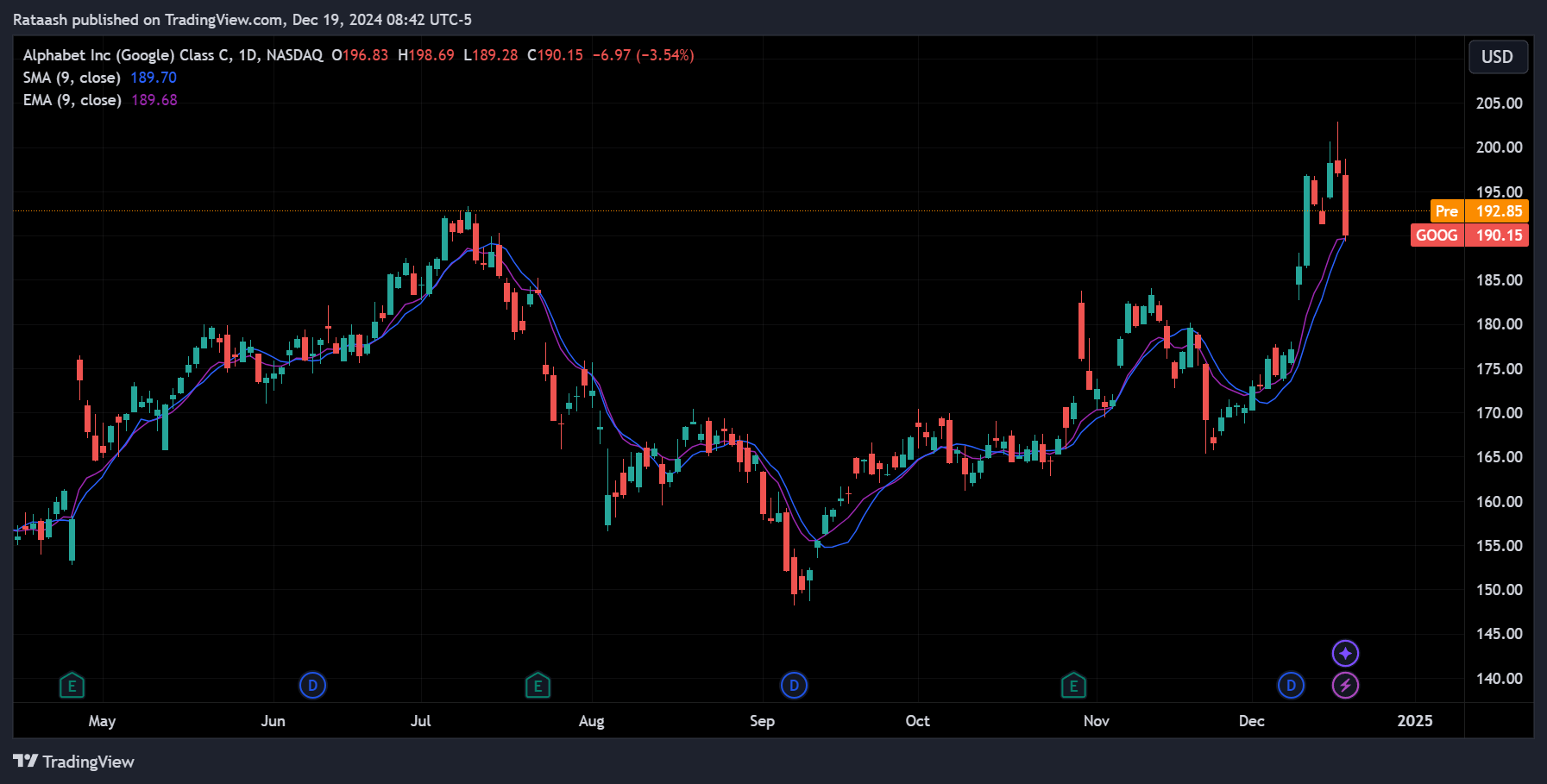
What is a Moving Average?
A moving average calculates the average price of a stock over a specified period. The most common periods are short-term (e.g., 9-day, 20-day) and medium-term (e.g., 50-day) for day trading. By smoothing out price fluctuations, moving averages make it easier to identify the underlying trend.
Simple Moving Average (SMA) vs. Exponential Moving Average (EMA):
- SMA: Assigns equal weight to all data points in the calculation period. It provides a smoother, more lagging signal.
- EMA: Gives greater weight to recent prices, making it more responsive to current market conditions.
How to Use MAs in Day Trading:
- Trend Confirmation: If price stays above a rising EMA, it suggests an uptrend.
- Support and Resistance: The moving average line often acts as dynamic support in an uptrend or resistance in a downtrend.
- Crossover Signals: A short-term moving average crossing above a longer-term moving average can signal a potential upward trend change.
Example:
If you’re day trading a stock and the 9-EMA crosses above the 20-EMA, this might indicate bullish momentum. You can use this signal as an entry point, placing a stop-loss order just below a recent swing low.
Moving Average Convergence Divergence (MACD)
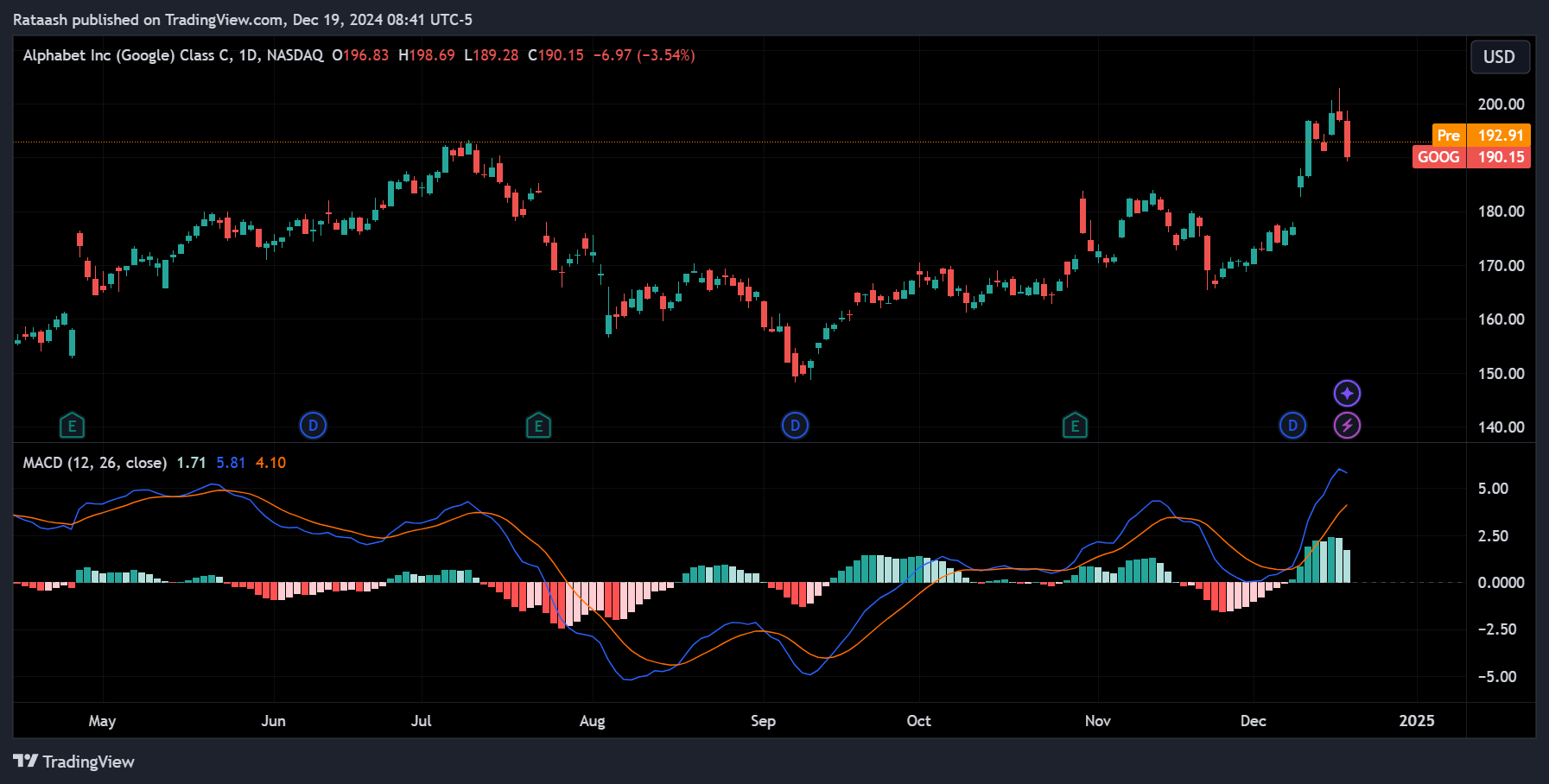
The MACD is a momentum indicator that helps traders identify trend changes and gauge market momentum. It consists of three components:
- MACD Line: The difference between two EMAs, typically the 12-EMA and 26-EMA.
- Signal Line: A 9-EMA of the MACD line, used for identifying turns.
- Histogram: Plots the difference between the MACD line and the signal line, visually representing momentum.
How to Use MACD in Day Trading:
- Crossover Signals: When the MACD line crosses above the signal line, it can suggest a bullish turn, while a cross below might indicate a bearish turn.
- Divergence: If the stock price makes new highs but the MACD does not, this divergence may signal weakening momentum and a potential reversal.
Example:
You spot a MACD line crossing above the signal line as the stock breaks above a recent resistance level. Combined, these signals suggest a potential upside run, prompting a long position.
Relative Strength Index (RSI)
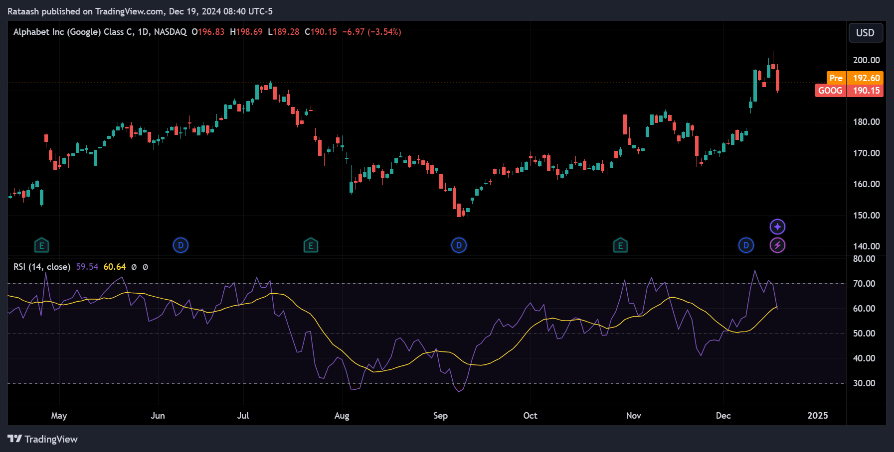
The RSI measures the magnitude of recent price changes to evaluate overbought or oversold conditions on a scale of 0 to 100.
- Overbought (70+): Price may have risen too far, too fast. A pullback or reversal could be near.
- Oversold (30 or below): Price might have fallen too far, too quickly, hinting at a potential bounce.
How to Use RSI in Day Trading:
- Identifying Reversals: An RSI above 70 combined with a candlestick pattern (like a bearish engulfing) could signal a potential short opportunity.
- Confirming Trends: If RSI remains consistently above 50 in an uptrend, it confirms strength, while below 50 in a downtrend confirms weakness.
Example:
A stock’s RSI dips to 28 following a sharp sell-off. You watch for a bullish candlestick formation on the chart. When it appears, you enter a long position, anticipating a short-term bounce.
Stochastic Oscillator
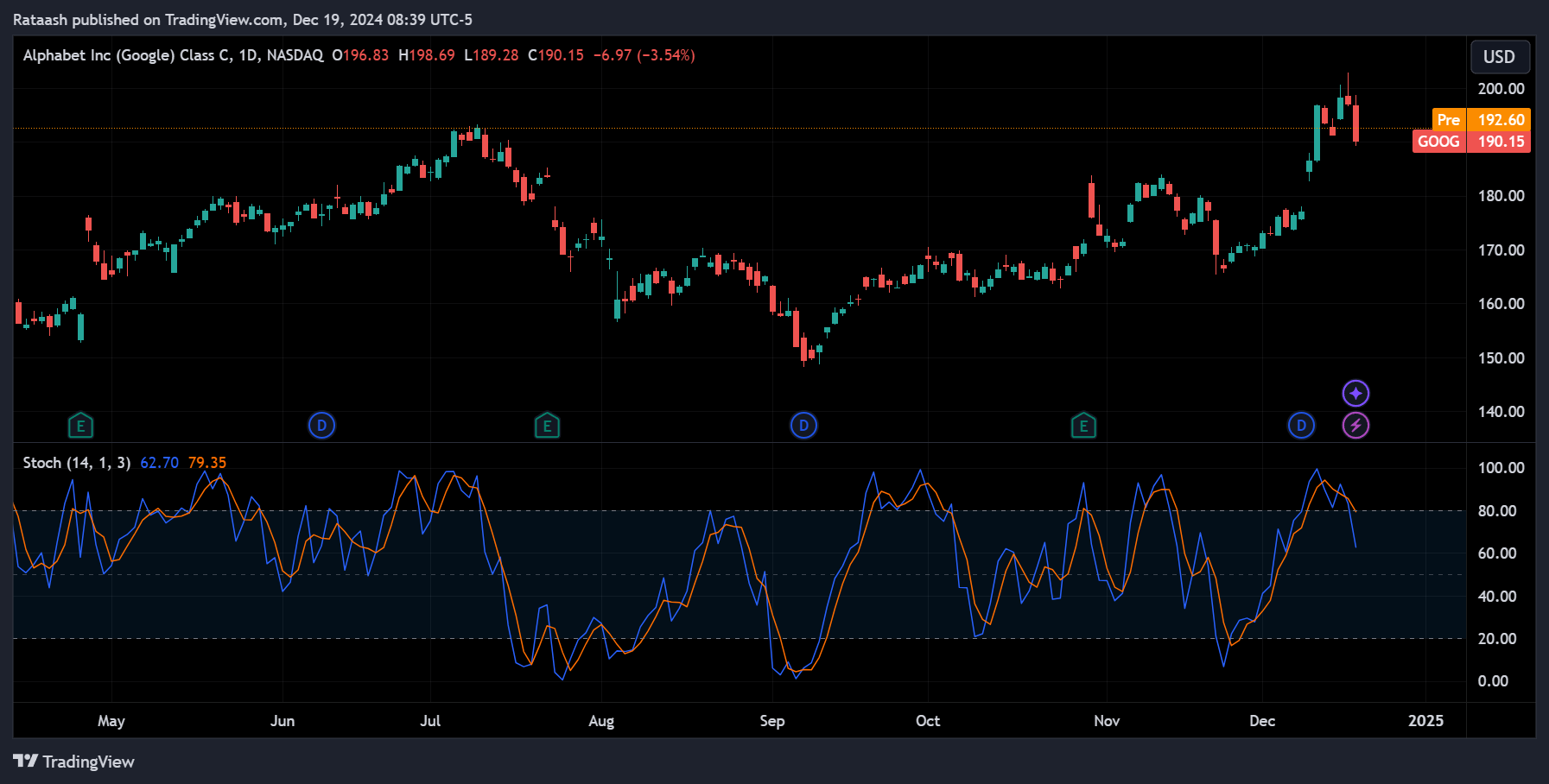
The Stochastic Oscillator compares a stock’s closing price to its price range over a specific period, typically 14 periods. It consists of two lines:
- %K Line: The current stochastic value.
- %D Line: A moving average of the %K, used as a signal line.
How to Use the Stochastic Oscillator:
- Overbought/ Oversold: Readings above 80 are often considered overbought, and below 20 are oversold.
- Crossovers: When the %K line crosses above %D in oversold territory, it may signal a bullish reversal. Conversely, a crossover in overbought territory may signal bearish reversal.
Example:
If a stock’s Stochastic falls below 20 and then %K crosses above %D, consider entering a long trade anticipating a reversal to the upside.
Bollinger Bands
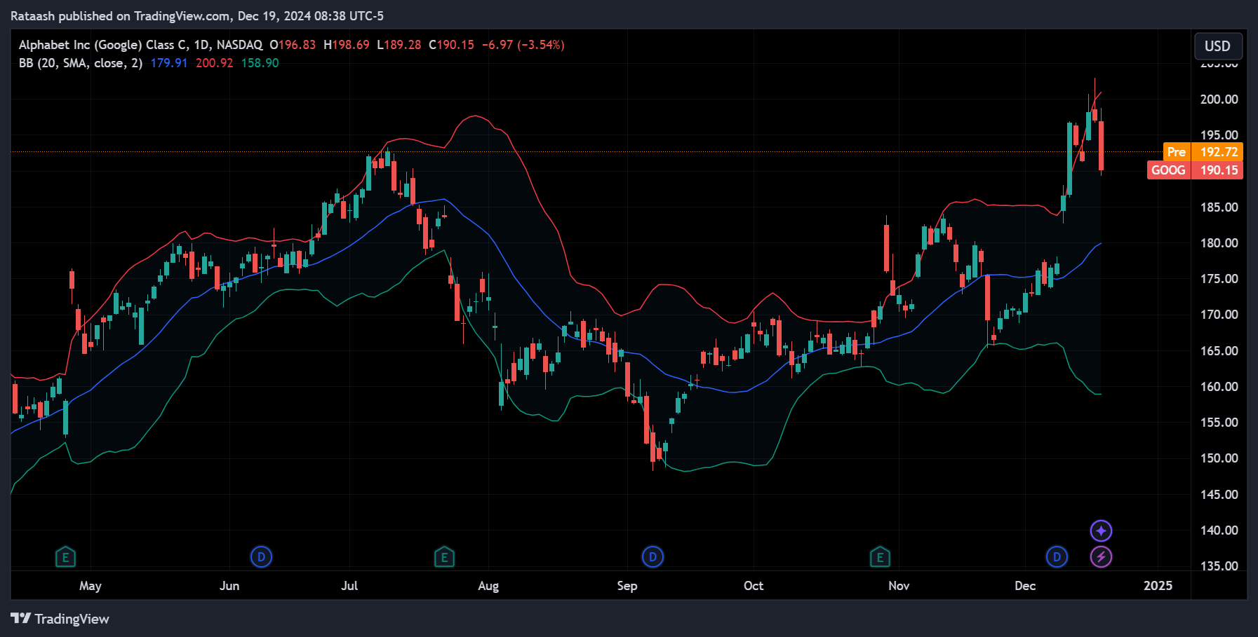
Bollinger Bands consist of three lines: a moving average (middle band), an upper band, and a lower band. The upper and lower bands adjust based on volatility, expanding in volatile markets and contracting in calmer conditions.
How to Use Bollinger Bands in Day Trading:
- Volatility Measurement: Wide bands indicate high volatility; narrow bands indicate low volatility.
- Mean Reversion Strategy: Price touching the upper band might hint at an overbought condition, potentially reversing towards the middle band. Similarly, touching the lower band may indicate oversold conditions.
- Bollinger Band Squeezes: When bands narrow significantly, it often precedes a strong breakout. Traders wait for a break above or below these tight bands to signal entry.
Example:
If a stock’s bands squeeze for several sessions, and suddenly the price breaks above the upper band on strong volume, it may signal the start of a new uptrend and a potential long trade.
Average True Range (ATR)
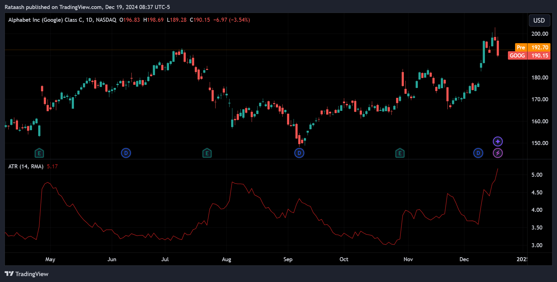
ATR measures market volatility by analyzing the range between highs and lows over a given time period. It doesn’t indicate trend direction but helps set realistic expectations for price movement and risk management.
How to Use ATR in Day Trading:
- Setting Stop-Loss Orders: Using a multiple of the ATR can help determine a reasonable distance for stop-loss orders. For instance, placing a stop-loss 1.5x ATR below your entry might keep you from being prematurely stopped out by minor fluctuations.
- Position Sizing: If ATR is high, you may reduce position size to account for increased risk. Conversely, lower ATR environments might allow for slightly larger positions.
Example:
If the ATR is $0.50 on a stock priced at $20, and you expect a 2:1 risk/reward ratio, you might set your stop-loss about $0.75 below your entry price to allow for normal volatility swings.
Volume Indicators (On-Balance Volume & VWAP)
On-Balance Volume (OBV):
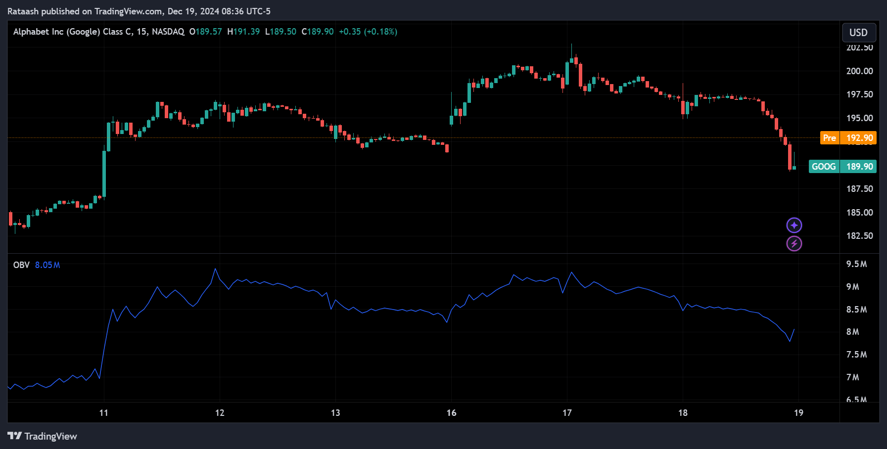
OBV adds up volume on up-days and subtracts volume on down-days, resulting in a cumulative line. If OBV rises, it indicates buyers accumulating shares; if it falls, it indicates sellers dominating.
Volume-Weighted Average Price (VWAP):
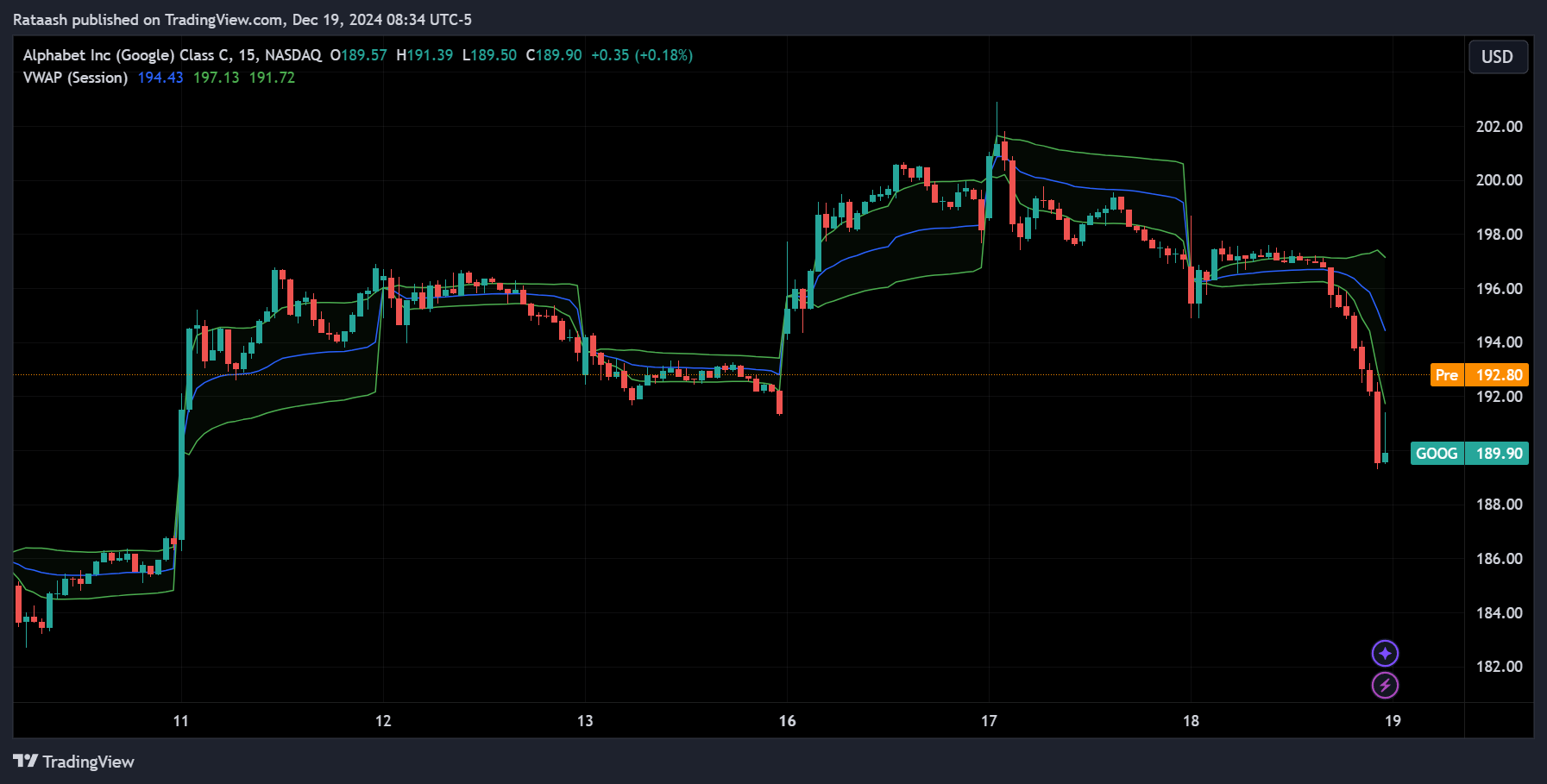
VWAP calculates the average price a stock has traded at throughout the day, weighted by volume. Day traders commonly use VWAP as an intraday benchmark:
- Above VWAP: Suggests buyers have control.
- Below VWAP: Suggests sellers are in control.
How to Use Volume Indicators:
- Trend Confirmation: Rising OBV can confirm an uptrend, while falling OBV can confirm a downtrend.
- Intraday Strategy with VWAP: Some day traders buy when price crosses above VWAP, expecting further upside. Conversely, price dropping below VWAP may signal an opportunity to short.
Example:
If a stock breaks out of resistance on high volume and OBV also starts trending higher, it’s a stronger signal that the breakout may continue.
Fibonacci Retracements
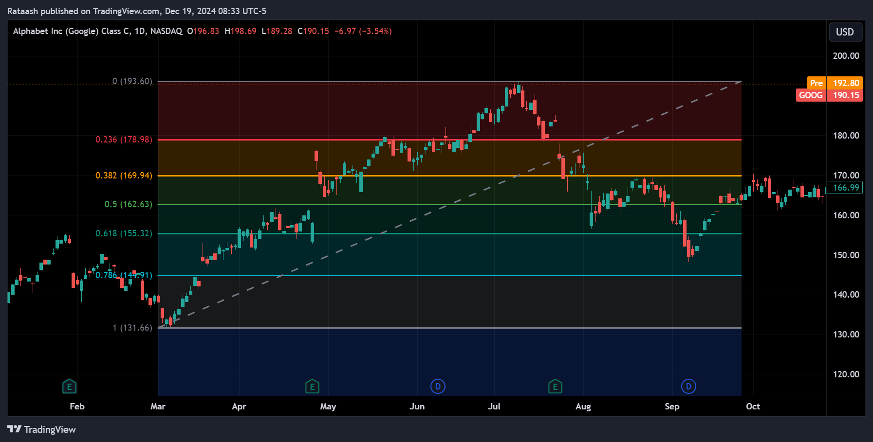
Fibonacci retracements use horizontal lines to indicate potential support and resistance areas at key percentage levels derived from the Fibonacci sequence (commonly 23.6%, 38.2%, 50%, 61.8%, and 78.6%).
How to Use Fibonacci Retracements:
- Support and Resistance: If a stock retraces 38.2% of a recent move and then resumes its original trend, that Fibonacci level may have acted as support or resistance.
- Entry & Exit Points: Combine Fibonacci levels with price action patterns or other indicators to pinpoint better entries and exits.
Example:
The stock rallies from $100 to $120, then pulls back to $114. If $114 aligns with the 38.2% Fibonacci retracement level, you may consider a long position if you see a bullish candle pattern there, anticipating a continuation of the uptrend.
Ichimoku Cloud
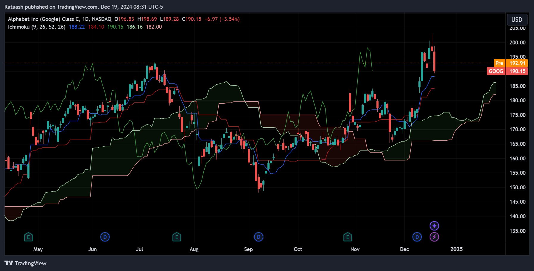
The Ichimoku Cloud provides a comprehensive view of market conditions by including multiple lines that represent support, resistance, trend direction, and momentum:
- Tenkan (Conversion Line): Short-term trend indicator.
- Kijun (Base Line): Medium-term trend indicator.
- Senkou Span A & B (Cloud): The area between these lines forms the ‘cloud,’ highlighting support/resistance and the trend.
- Chikou Span (Lagging Line): Confirms momentum by comparing current price to past price.
How to Use the Ichimoku Cloud:
- Trend Direction: When price is above the cloud, conditions are generally bullish. Below the cloud is bearish. Inside the cloud often means consolidation.
- Signal Line Crosses: A Tenkan crossing above the Kijun in a bullish manner, while price trades above the cloud, can signal a strong uptrend and a potential buying opportunity.
Example:
If the stock is above the cloud and the Tenkan line crosses above the Kijun line, you may consider a long trade. Set a stop-loss below the cloud as it often acts as a dynamic support area.
Pivot Points
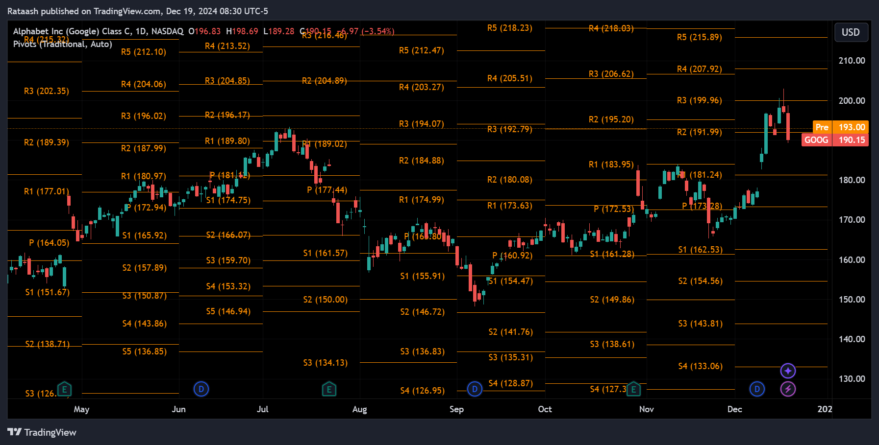
Pivot points are levels calculated from the previous day’s high, low, and close prices. These levels include the main pivot point, plus several support (S1, S2, S3) and resistance (R1, R2, R3) levels.
How to Use Pivot Points:
- Intraday Support & Resistance: Day traders often watch pivot points to determine where price might stall, reverse, or break out.
- Trade Entries & Exits: Buying near a pivot support level and taking profit near a pivot resistance level is a common strategy.
Example:
If the price approaches the daily pivot point from above, it may act as support. You could buy at the pivot point and set a target at the first resistance level (R1).
Combining Indicators for More Accurate Signals
While each indicator can provide useful information, relying on one alone can be risky. Combining multiple indicators can help confirm signals and reduce false entries. For example:
- MACD + RSI: Confirm that RSI is oversold just as MACD turns bullish to validate a long entry.
- Bollinger Bands + Volume: If price breaks out of tight Bollinger Bands on high volume, it suggests a strong move may be underway.
- Fibonacci + Ichimoku: Use a Fibonacci retracement level that aligns with the Ichimoku Cloud’s support to strengthen the credibility of a trade setup.
Avoiding Indicator Overload:
Too many indicators can create confusion and conflicting signals. Stick to a few that you understand well and that complement each other. For instance, pair a trend indicator (e.g., EMA) with a momentum indicator (e.g., RSI) and a volume indicator (e.g., OBV) to get a well-rounded view of the market.
Common Mistakes to Avoid When Using Indicators

- Over-Reliance on a Single Indicator:
Don’t depend solely on one indicator. Markets are dynamic, and a single tool rarely captures the complete picture. - Not Adjusting Indicator Parameters:
Default settings might not fit every stock or market condition. Experiment with different parameters (like the period of an EMA or RSI) until you find settings that complement your trading style. - Ignoring Fundamental Context Entirely:
While day traders focus more on technicals, ignoring big news events or earnings reports can lead to unpleasant surprises. Use indicators, but remain aware of upcoming announcements. - Lack of Risk Management:
Indicators can’t guarantee profits. Always use stop-losses, manage position sizes, and maintain a disciplined trading plan. Even the best indicator setups fail sometimes.
Building Your Own Trading Strategy Using Indicators Step-by-Step Guide
- Identify Your Trading Style:
Are you a scalper taking multiple small trades daily or a trader who prefers fewer, but more substantial moves? Shorter timeframes may benefit from faster indicators like a 9-EMA, while slightly longer holding periods might use a 20-EMA. - Choose Your Indicators Wisely:
Pick one trend-following indicator (e.g., EMA), one momentum indicator (e.g., RSI), and possibly a volume indicator (e.g., VWAP). This combination can provide a balanced perspective. - Define Your Entry and Exit Rules:
For instance, you might enter a long trade when price closes above the EMA and RSI rises above 50, confirming upward momentum. For exits, perhaps you take profit when RSI enters overbought territory or when price falls below VWAP. - Set Risk Parameters:
Use ATR to determine stop-loss levels and position sizing. If the ATR is relatively high, reduce your position size to manage volatility risk. - Backtest Your Strategy:
Apply your chosen indicators and rules to historical price data. Does the strategy produce consistent profits, or does it fail frequently? Adjust and refine as needed. - Forward Test in a Demo Account:
Test your refined strategy in real-time with paper trading. Pay attention to execution, market conditions, and whether the indicators perform as expected. - Continuously Improve and Update:
Markets evolve. Revisit your strategy periodically, adjust parameters, and consider adding or removing indicators based on ongoing performance.
Frequently Asked Questions (FAQ)
1. Can I rely solely on technical indicators for day trading success?
While technical indicators provide valuable insights into price trends, momentum, and volatility, they should not be the only factor guiding your trades. It’s best to combine indicators with strong risk management, market context, and an understanding of broader market conditions. Many traders also keep an eye on economic calendars and company announcements to avoid surprises.
2. What timeframes work best for these indicators in day trading?
Most day traders use short-term charts like 1-minute, 5-minute, or 15-minute intervals. That said, the “best” timeframe varies by trading style and the indicator’s responsiveness. Experiment with different intervals to see which yields consistent, actionable signals for your strategy.
3. How many indicators should I use at once?
While there’s no strict rule, using too many indicators can lead to confusion and “analysis paralysis.” A balanced approach might include one trend indicator, one momentum or oscillator indicator, and one volume-based indicator. Start simple and add more only if each tool clearly enhances your decision-making.
4. Do I need to adjust the default settings of indicators?
Default settings are a starting point, but they may not suit every stock or market condition. Adjusting parameters (like period lengths for moving averages or RSI) can fine-tune indicators to better align with your trading style and market volatility.
5. Are some indicators better for volatile stocks than others?
Yes. Volatility indicators like Bollinger Bands or ATR are particularly useful in highly volatile stocks. They help you gauge potential price swings and determine appropriate stop-loss levels. Volume-based indicators also become crucial, as volume often spikes during volatility, confirming the strength of price moves.
6. How do I use indicators to set stop-loss and take-profit levels?
You can set stop-losses based on ATR (for volatility-based stops) or near a key support/resistance identified by moving averages or pivot points. Take-profit levels can be set when RSI hits overbought/oversold extremes, or when price approaches a significant Fibonacci level. Combine these methods to create a logical and disciplined exit strategy.
7. Can fundamental factors influence the reliability of indicators?
Yes. Major news events, earnings reports, or economic announcements can cause sudden price swings that indicators may not predict in advance. Even if you rely heavily on technicals, remain aware of key market events that can overshadow indicator signals.
8. How can I practice and improve my use of indicators without risking real money?
Use a demo or paper trading account to apply your chosen indicators and strategies in real-time market conditions. This allows you to identify what works and what doesn’t before committing actual capital.
9. Do professional traders use indicators or just price action?
Professional traders often use a combination of both. Some rely heavily on price action and volume, while others incorporate a few carefully selected indicators. Ultimately, each trader’s approach is unique, shaped by their experience, risk tolerance, and trading style.
10. How often should I review and adjust my indicator-based strategy?
Regularly review your strategy’s performance, especially after significant market changes. Markets evolve, and what worked six months ago may not work as well now. Adjust parameters, try different timeframes, or consider adding/removing indicators if performance falters.
Conclusion
Technical indicators can provide a roadmap in the complex world of day trading. By understanding the best indicators for day trading stocks—such as Moving Averages, MACD, RSI, Stochastic, Bollinger Bands, ATR, volume-based indicators, Fibonacci retracements, Ichimoku Cloud, and pivot points—you arm yourself with essential tools to navigate intraday price action effectively.
The best way to practice and explore these indicators is by using a powerful charting platform like TradingView, which offers intuitive tools, customizable charts, and a wide array of indicators to suit your trading style. Its user-friendly interface makes it an excellent choice for beginners and experienced traders alike.
Remember, success in day trading does not come from blindly following indicators. It’s about learning how they work, combining them judiciously, and using them to support a well-defined trading plan. Practice patience, apply sound risk management, and continuously refine your approach. Over time, as you gain experience and confidence, these indicators can enhance your decision-making and help you achieve your day trading goals.
By starting small, focusing on a few key indicators, and building a strong, tested strategy, you’ll be well on your way toward more informed and successful day trading.