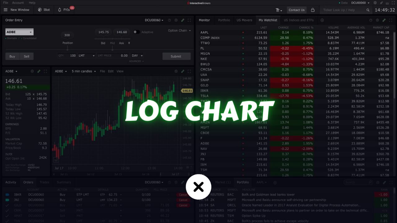
A logarithmic scale chart, often referred to as a log chart, is a type of chart commonly used in trading and finance to visualize the price movements of assets. It’s one of the charts we use for technical analysis.
Unlike linear scale charts, where each unit on the y-axis represents an equal difference in price, logarithmic scale charts represent equal percentage changes in price.
Logarithmic scale charts are mainly used in cryptocurrency trading and investment. However, they’re not widely used in the stock market or other trading areas.
They are particularly useful when you want to visualize price movements over long periods of time or when an asset’s price has experienced significant changes. This is because they can help compress large price ranges and make it easier to identify and analyze price trends and patterns.
The main advantage of using a logarithmic scale chart in trading is that it helps in depicting both small and large price movements on a single chart.
In cases where an asset’s price has undergone exponential growth or decline, a logarithmic scale chart can prevent the chart from becoming too skewed and allow traders to better observe and analyze the overall trend.
How Logarithmic Scale Charts Made?
Constructing a logarithmic scale chart involves transforming the price data to reflect percentage changes rather than absolute price changes. This transformation is achieved by taking the logarithm of the price values.
For example, if the price of an asset doubles, the corresponding y-value on a logarithmic scale chart would increase by a fixed percentage rather than a fixed amount.
Vertical Axis (y-axis):
The vertical axis represents the price levels of the asset being charted. However, instead of representing fixed price intervals, each interval represents a percentage change in price. This means that as you move up the y-axis, the values increase exponentially.
For example, the distance between 10 and 20 might be the same as the distance between 100 and 200, since they both represent a doubling of the price.
Horizontal Axis (x-axis):
The horizontal axis represents time, typically in chronological order. Each point on the x-axis corresponds to a specific time period, such as days, weeks, months, etc.
Benefits of Logarithmic Scale Charts in Trading
Visualizing Percentage Changes: Logarithmic scale charts provide a clearer depiction of percentage changes in price over time. This is particularly beneficial for identifying trends and patterns, especially in assets with volatile price movements.
Equal Percentage Spacing: Unlike linear scale charts, where equal spacing represents equal absolute price changes, logarithmic scale charts ensure that equal spacing corresponds to equal percentage changes. This helps traders better assess the significance of price movements regardless of the asset’s price level.
Better Long-Term Analysis: Logarithmic scale charts are well-suited for long-term analysis, especially when examining historical price data spanning several years or decades. They can effectively capture the magnitude of price changes over extended periods, providing valuable insights for long-term investment strategies.
Smoothing Price Volatility: By compressing large price movements and expanding smaller ones, logarithmic scale charts can help smooth out price volatility, making it easier for traders to identify underlying trends amidst short-term fluctuations.
Enhanced Comparisons: Logarithmic scale charts facilitate easier comparison between assets with different price levels and volatilities. This is particularly useful when comparing the performance of various securities or indices over time.
Example:
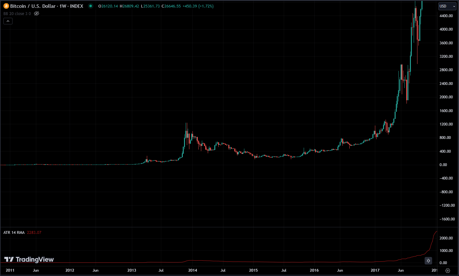
Let’s take a look at the price of Bitcoin. Back in late 2013, prices were quite low, staying below $100. But then, they shot up from $100 to $1100. Now, the price has jumped by $1000 from $100 to $1100, the significance of this change is a tenfold increase, indicating a remarkable 1000% return.
Now, let’s imagine this situation: starting at $1000, with a 1000% return, the amount rises to $11000. The chart shows a big move.
The increase from $1000 to $11000 is also a 10-fold rise, but notice the major difference compared to the jump from $100 to $1100. This difference happens because of how these charts are set up with dollar value intervals.
Going from $100 to $1100 isn’t the same as going from $10000 to $11000. The $1000 increase in this case only represents a 10% rise. In contrast, the jump from 100 to 1100 shows a significant 1000% return.
So, our goal is to use a chart that emphasizes percentages because the importance of dollar value decreases when asset prices experience big swings.
It doesn’t make sense to compare a situation where something went from $1 to $1000 with another scenario where it increased by $1000 when already at $20000. These situations are fundamentally different. This is exactly where logarithmic charts become useful.
In our primary charting tool, TradingView, there is an option (ALT + L) to visualize logarithmic charts. This feature converts a linear chart into a logarithmic format, altering the chart’s value intervals to be based on percentages.
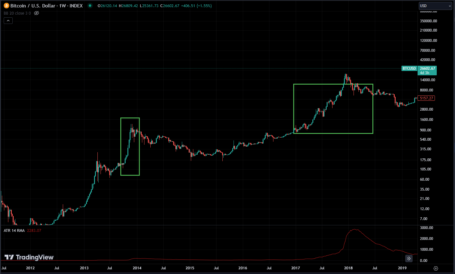
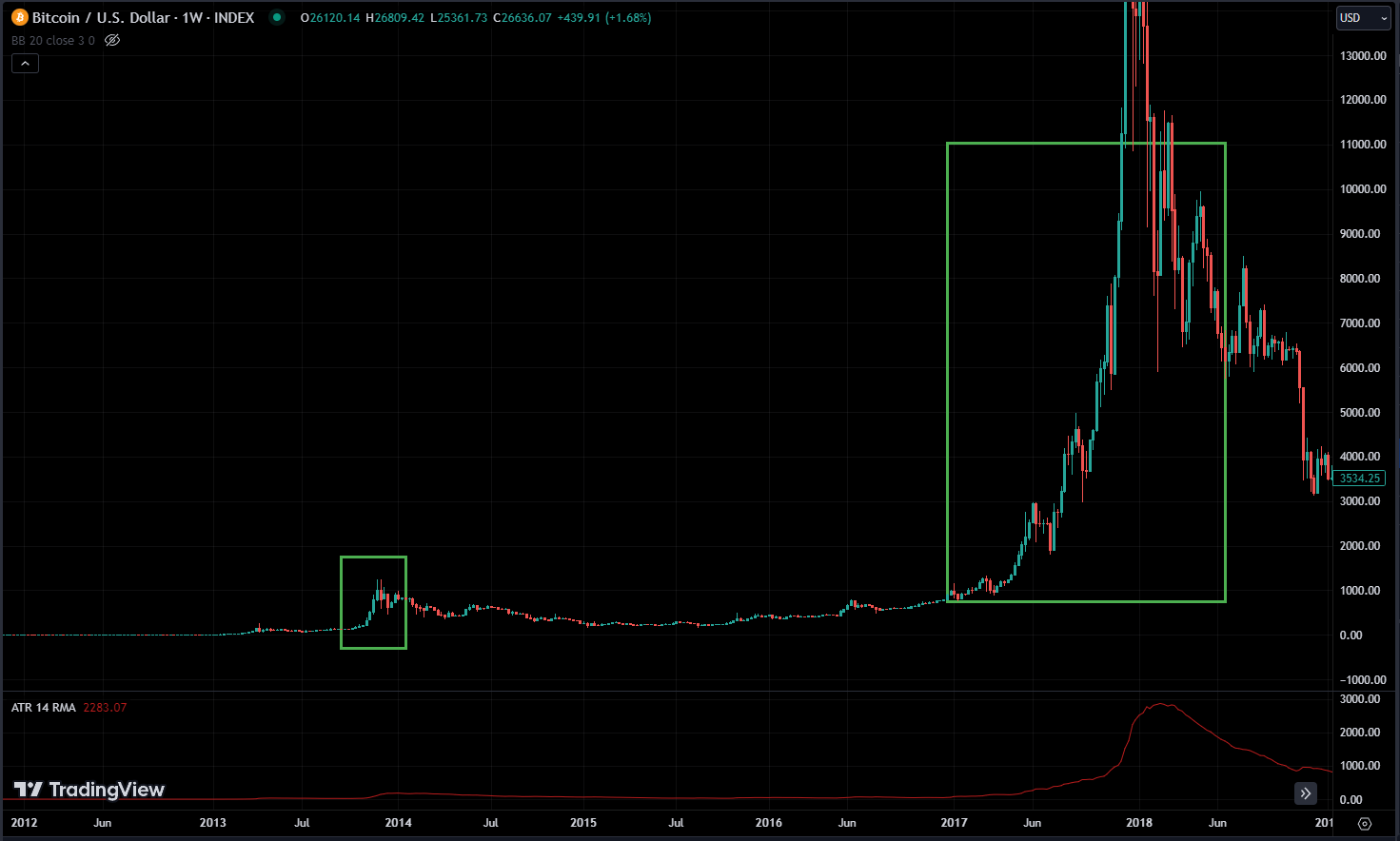
Looking at a logarithmic chart for Bitcoin, you can see that there was a significant movement in late 2013. This was followed by a crash, and then there was a notable surge in 2017, followed by a significant crash in 2018.
When we compare these movements, a closer look at the crash on the logarithmic chart suggests that it might not be as severe as it seems on a linear chart. When viewed from a percentage perspective, the crash and the following recovery don’t seem as alarming.
Such fluctuations are common within an asset class as volatile as this one. Similarly, the upward price movements reflect past patterns, with both movements showing identical percentages.
However, these similarities aren’t immediately obvious on a linear chart, where the impression of significant movement is magnified.
When analyzing something that has gone through significant fluctuations, observing a logarithmic chart offers a comprehensive view and helps in assessing potential future movements, whether upward or downward.
Conclusion
Logarithmic scale charts play a vital role in technical analysis, offering traders a powerful tool for interpreting price movements and identifying trading opportunities. By representing price changes on a percentage rather than absolute scale, logarithmic scale charts provide a more accurate and intuitive depiction of market dynamics, especially for assets with exponential growth or decline patterns.