
Before we dive into different types of technical charts, let’s first understand the concept of technical analysis.
What is Technical Analysis?
Technical analysis for trading is a method of evaluating securities/assets based on statistical trends and patterns in market data, such as price and volume.
It is used to identify potential trading opportunities by analyzing past market movements to predict future trends.
Technical analysts use charts, graphs, and other visual representations of market data to identify trends and patterns.
They may also use various technical indicators, such as moving averages, relative strength index (RSI), and Bollinger bands, to help identify potential buy or sell signals.
The basic idea behind technical analysis is that market trends tend to repeat themselves over time, and by identifying these trends, traders can predict future price movements and make informed trading decisions.
Technical analysts believe that the market reflects all available information, including market trends and investor sentiment, and that by analyzing this data, they can gain a better understanding of where the market is headed.
Technical analysis is concerned with the price and volume. which can be observed on charts.
What are Financial Market Charts?
A financial market chart is a graphical representation of financial data, usually showing the historical price and volume movements of an asset over a period of time.
A visual depiction of the prices at which a product was traded during different time intervals. the vertical axis represents the price, while the horizontal axis represents time. It displays the changes in supply and demand over time.
This implies that when the price increases, it indicates that the demand for the product exceeds its supply. conversely, a decrease in price implies that the supply is greater than the demand.
If the price is falling, it means that more sellers are willing to sell the asset, while fewer buyers are willing to buy it. On the other hand, if the price is going up, it means that more people are willing to buy the asset, while fewer sellers are willing to sell.
There are different types of technical charts, like line charts, bar charts, and candlestick charts. We’ll focus on candlestick charts because they give the most information available. and we’ll only use line and candlestick charts because they’re the only types we will ever need.
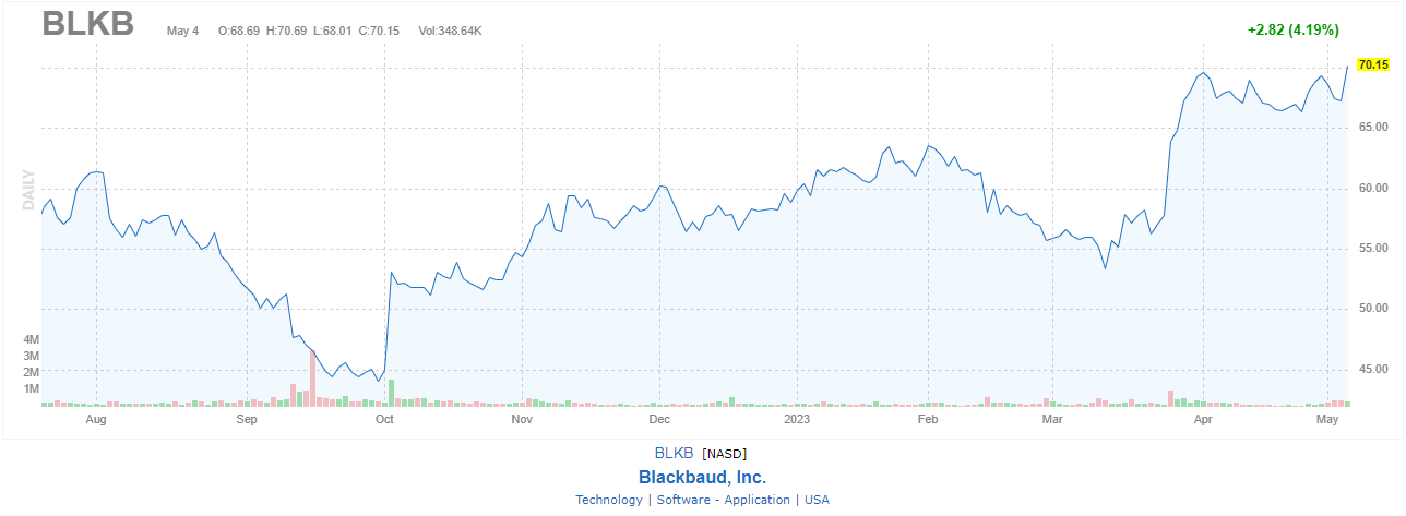
What are Line Charts?
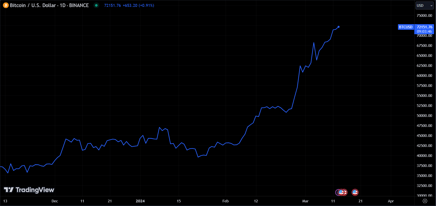
A line chart is a basic type of chart that is commonly used in finance to represent the historical price movements of an asset over time.
The chart displays a continuous line that connects a series of data points, each of which represents the price of the security at a particular time.
In a line chart, the vertical axis represents the price of the security, while the horizontal axis represents time. just like the other charts.
The data points are plotted on the chart based on their corresponding time and price values, and the lines are drawn between the points to create a continuous line.
Line charts are useful for visualizing trends in the price of a security over time, and for identifying support and resistance levels.
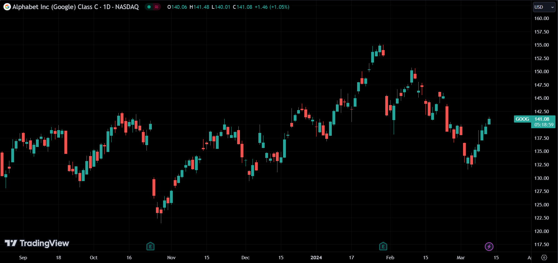
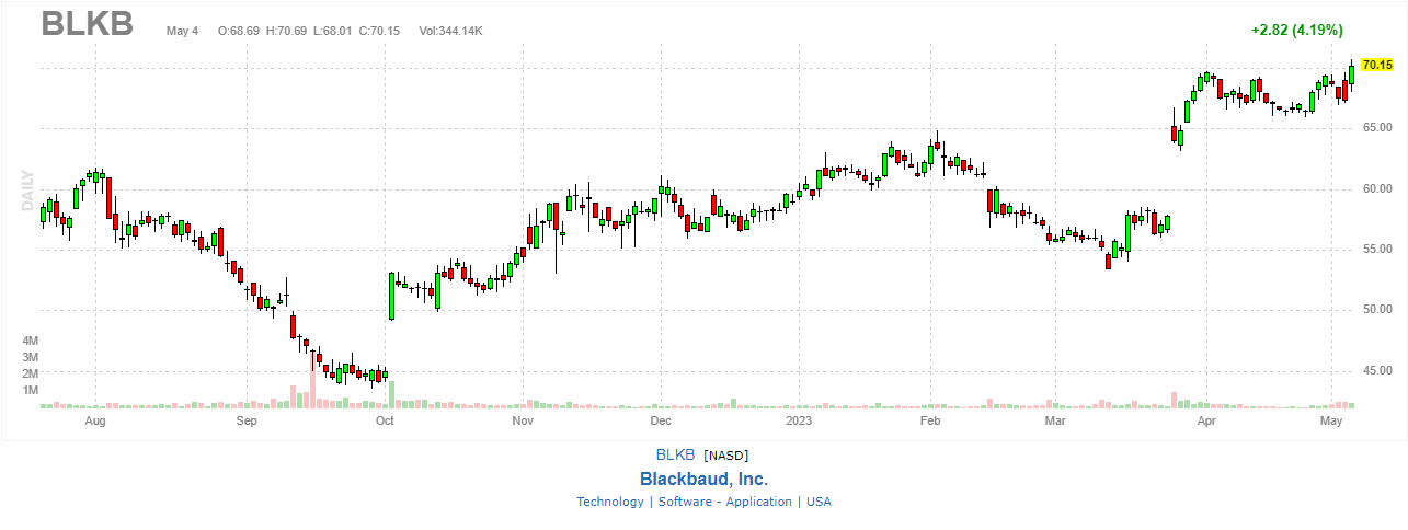
What are Candlestick Charts?
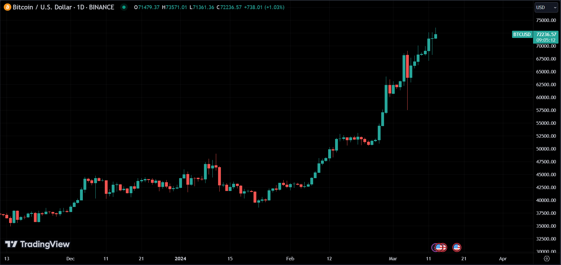
Candlestick charts provide more detailed information than line charts or bar charts, making them popular among technical analysts.
Candlestick charts display the opening, high, low, and closing prices of an asset for a given period in a visually appealing way.
Each candlestick represents a trading session, with the body of the candlestick showing the opening and closing prices, and the wicks or shadows representing the high and low prices for that session.
With a line chart, we can only see that the price is moved, but with a candlestick chart, we can see how it’s moved. take a look.
To learn how to interpret candlestick charts, we must first understand the nature of candlesticks and how to put them together to derive the most information available. which we will learn in the next article.
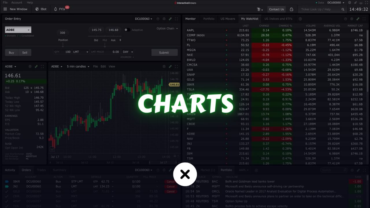
TradingView is the best charting software available today. Have a look.
Technical analysis for trading is an extensive topic, and it’s not possible to cover everything in a single article. Therefore, I’ve divided the information into multiple articles. For a comprehensive understanding, please proceed to read the following articles.