
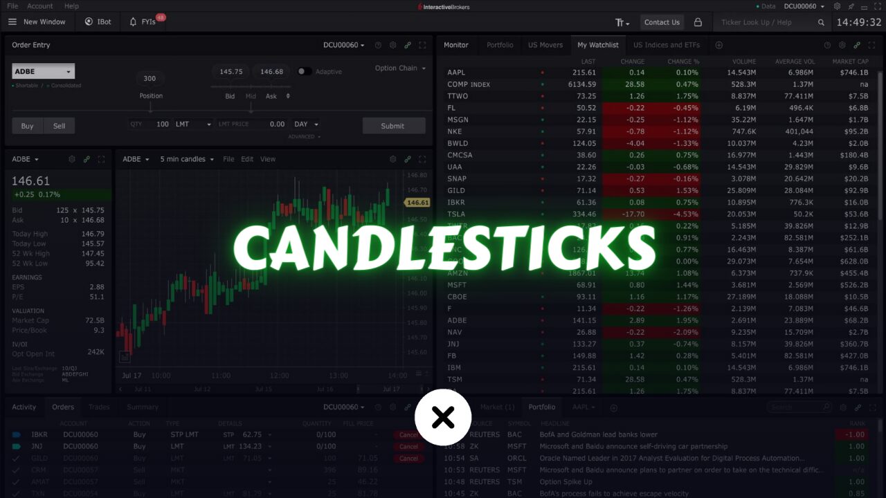
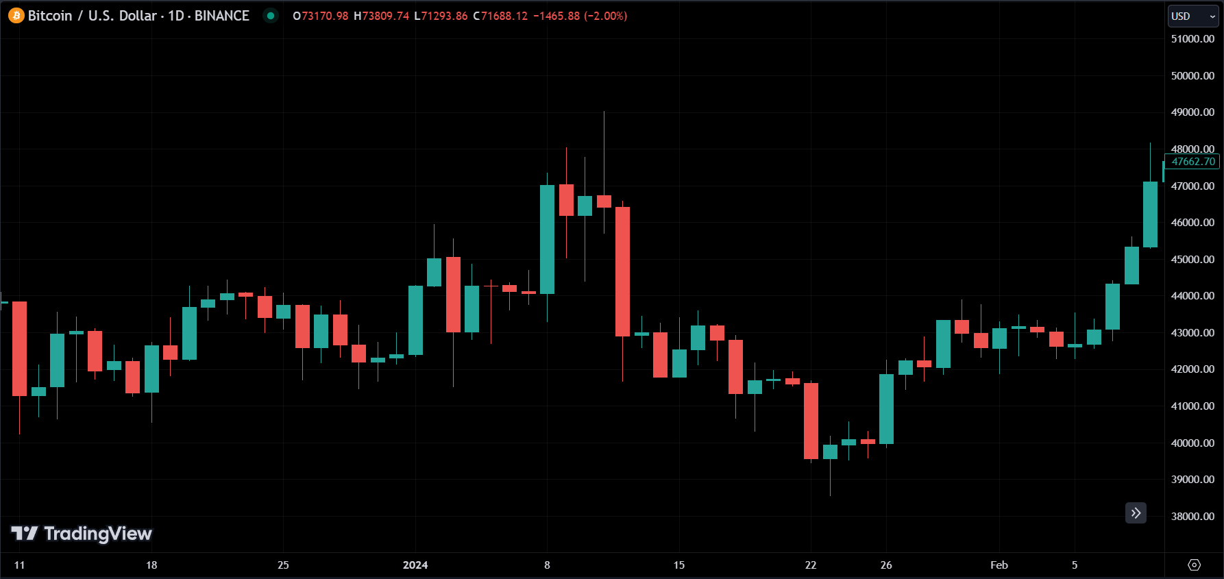
Candlesticks charts are a type of chart used to represent the price movements in financial markets. they provide a visual representation of the price action over a specified time period, usually ranging from a few minutes to several years.
Each candlestick on the chart represents a single trading period, such as a day, week, or month, and consists of a rectangular body with a thin line extending from either end called the wick or shadow.
To understand how to read candlesticks patterns, we need to get to know candlesticks better.
What are Candlesticks?
The body of the candlestick represents the opening and closing price of the asset during that period, while the wick represents the high and low prices.
If the closing price of the asset is higher than the opening price, the candlestick is typically colored green or white and is referred to as a bullish candle. Conversely, if the closing price is lower than the opening price, the candlestick is typically colored red or black and is referred to as a bearish candle.
Open, high, low, and close (OHLC) are the four key prices represented in a candlestick.
The open price represents the initial trading price of the asset for a specified time interval, be it a minute, hour, day, week, or month.
On the other hand, the high price corresponds to the peak value reached by the asset during that same time frame, while the low price indicates the minimum value it reached.
Finally, the close price signifies the last trading price of the asset within the identical period.
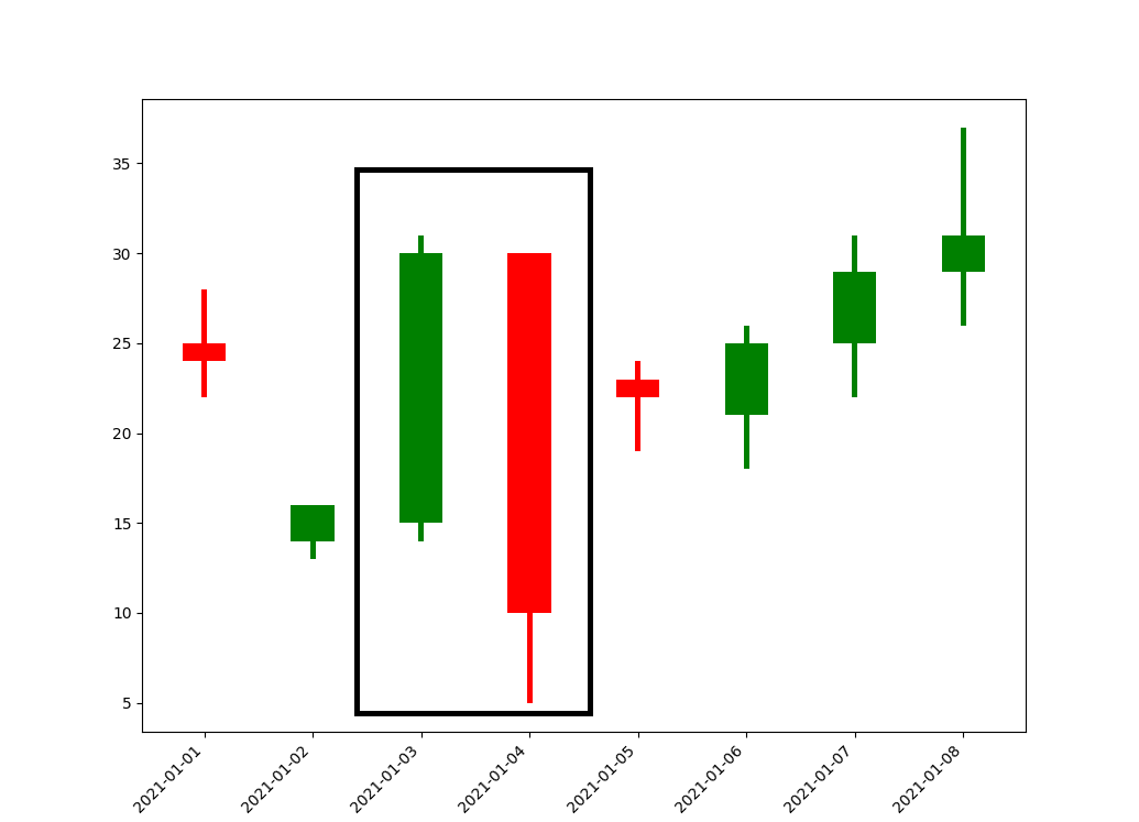
Example:
Let’s look at a daily candle, which means each candle represents a day.
The opening price of this candlestick was 7 USD, following which the price began to decline until it reached a low of 5 USD. Subsequently, the price recovered and rose to a high of 15 USD before declining again and closing at 10 USD.
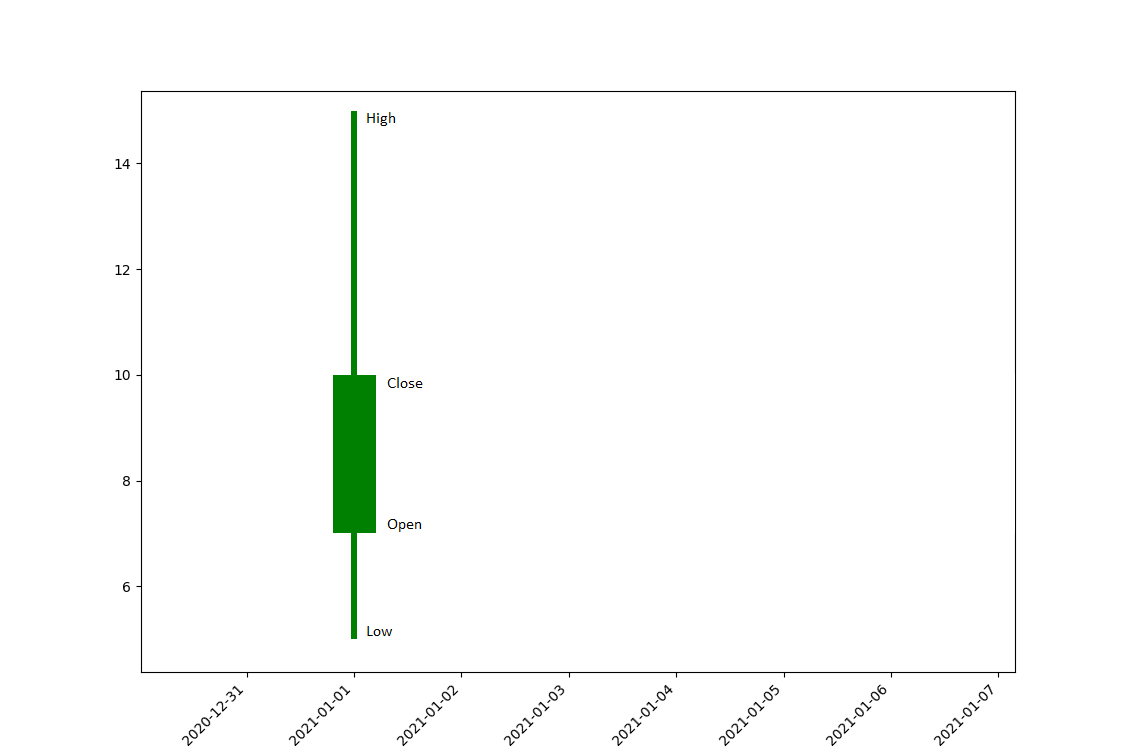
It’s colored in green because the closing price is a better price than the opening price.
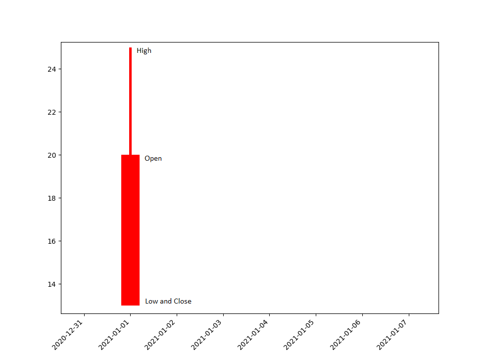
Now another candle with an opening price of 20, the price subsequently climbed to 25 before dropping back to 13. It is colored red because the closing price is lower than the opening price.
By now, you should have gained an understanding of candlesticks and how the combination of these individual candlesticks forms the candlestick chart.
Understanding and Familiarizing oneself with common types and patterns in candlesticks is essential in order to derive supply and demand data from the charts. let’s have a look one by one.
What are Big Candles?
As its name says, a big candle means a candle with a big body, compared to other candles. big candles mean one thing either supply or demand is very high during that period of time.
A large green candlestick indicates high demand, while a large red candlestick suggests that supply exceeds demand.
A large green candle suggests that buyers were in control during that period, and the price rose significantly. This indicates strong demand for the asset, and buyers were willing to pay higher prices to acquire it.
Conversely, a large red candlestick indicates that sellers were in control during that period, and the price fell significantly. This suggests that supply exceeded demand, and sellers were willing to accept lower prices to sell the asset.
What are Dojis?
A Doji is a candlestick pattern that occurs when the opening and closing prices are very close or almost equal. this results in a very small body with long upper and lower shadows. It looks like a cross or a plus sign. and it signals indecision or uncertainty in the market.
Doji candles occur when the market opens and closes at or near the same price level, but the price has moved significantly up and down during the trading period.
The long upper and lower shadows indicate that there was buying and selling activity during the period, but neither the buyers nor sellers were able to gain control of the market.
Traders often look for Doji candles as they can provide insights into potential market reversals or changes in trend direction.
When you have a dojis with big high and low or in other words wicks. which means it’s more indecision about the direction of the price.
Doji can have a little body, but it still gives the same meaning “Indecision”.
What are Gravestone / Dragonfly?
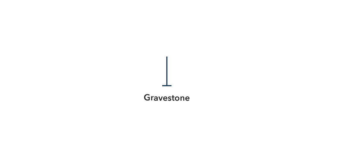
A Gravestone Doji occurs when the opening and closing prices are the same, and the candle has a long upper shadow with little or no lower shadow.
The candlestick looks like an inverted “T” and tells us, that the market opened at a price buyers pushed the price up high, but sellers took control and pushed the price down, leaving it near the low of the trading period.
The Gravestone Doji is often interpreted as a bearish signal, indicating a potential trend reversal or a downward price movement.
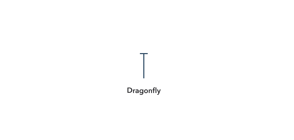
A Dragonfly Doji, on the other hand, is a bullish signal and suggests a potential trend reversal or upward price movement.
It occurs when the opening and closing prices are the same, and the candle has a long lower shadow and little or no upper shadow.
The candlestick looks like a “T” or an inverted hammer and tells that the market opened at a price sellers pushed the price down low, but buyers regained control and pushed the price up, leaving it near the high of the trading period.
What is Hammer / Shooting Star?
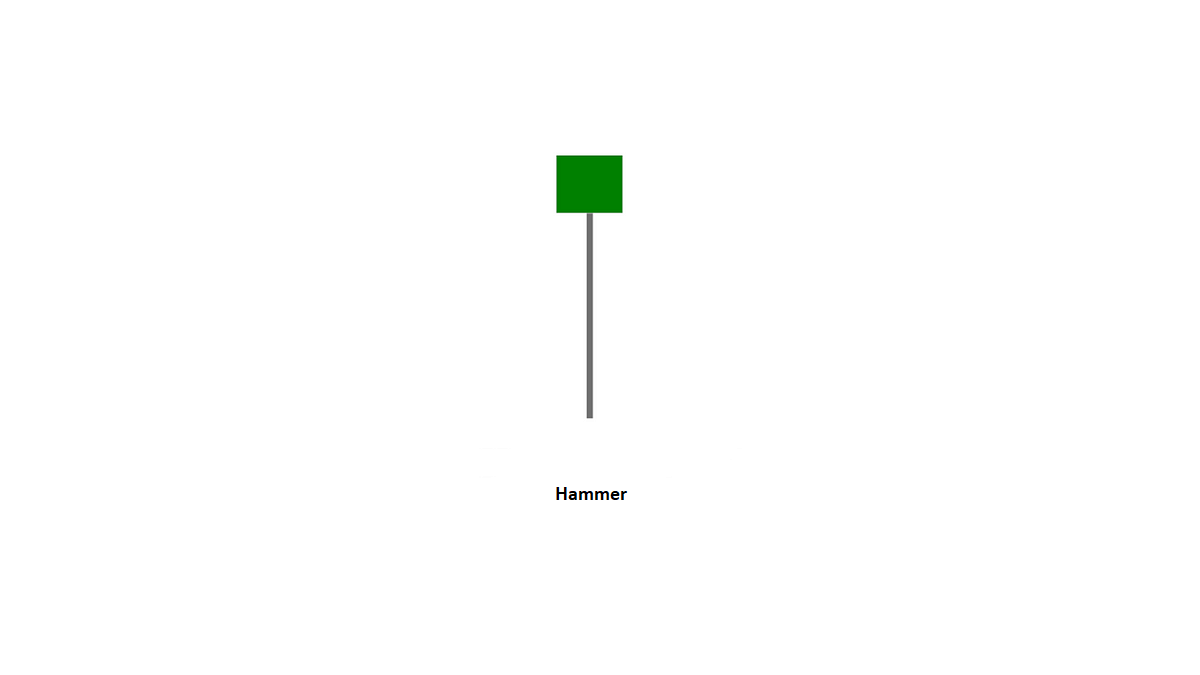
Looks similar to a gravestone. It has a small body with a long lower shadow and little or no upper shadow.
The long lower shadow indicates that buyers were able to push the price up from the low of the trading period and that tells us buyers had the advantage at the end.
Traders often look for Hammers as they can provide a signal for a potential trend reversal or an upward price movement.
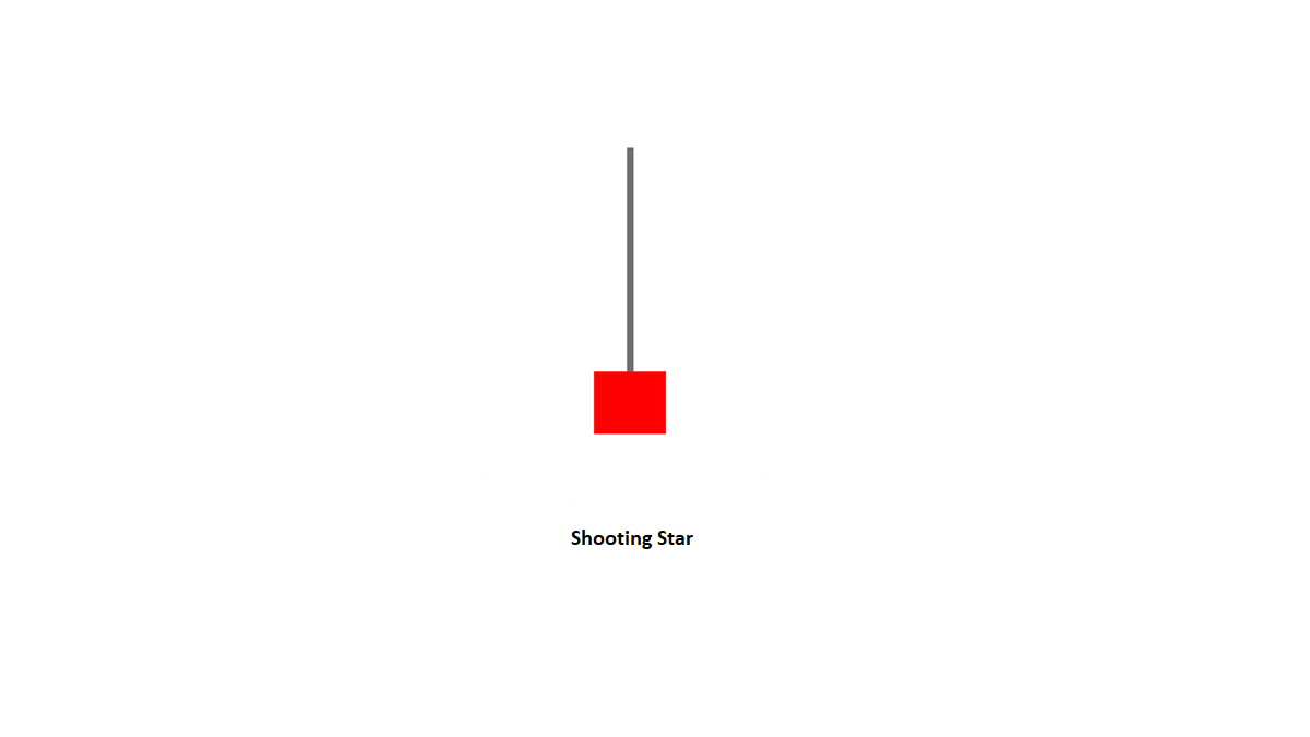
Very similar to a dragonfly, It has a small body with a long upper shadow and little or no lower shadow.
The long upper shadow indicates that sellers were able to push the price down from the high of the trading period and that tells us sellers had the advantage at the end. Indicates a trend reversal going on.
So different names but have the same meaning. this is why names are useless here.
It is not necessary to remember the names of candlestick patterns, as the most important thing is to understand the supply and demand of each candle.
Whether it’s a Doji or a Gravestone, what matters is the information it provides and the insights it offers about market sentiment and supply and demand.
You don’t need to memorize hundreds of different candlestick patterns if you understand how to interpret the information they provide.
The candlestick patterns mentioned here are among the most commonly used ones in trading. to make successful trades, it’s important to consider what other traders are seeing and analyzing.
Because ultimately, it’s the orders placed by market participants that drive the price movement. as attempting to trade based on information that other traders are not aware of is unlikely to be successful.
So you want to see what other people are seeing.
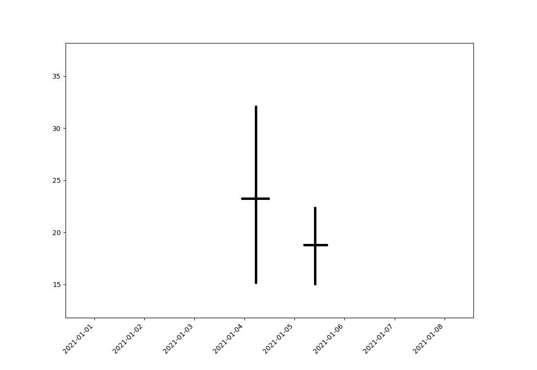
Example:
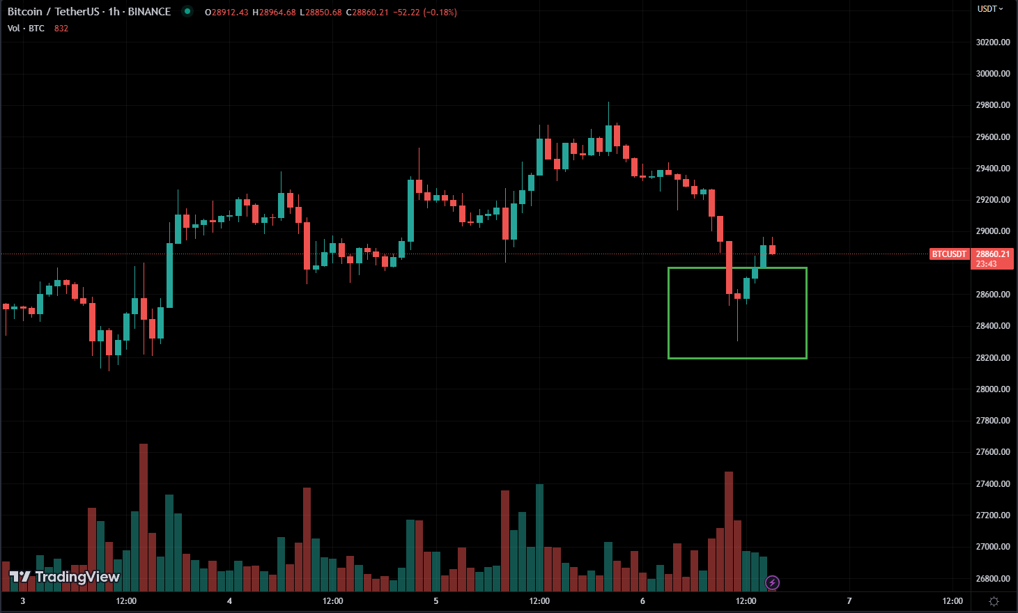
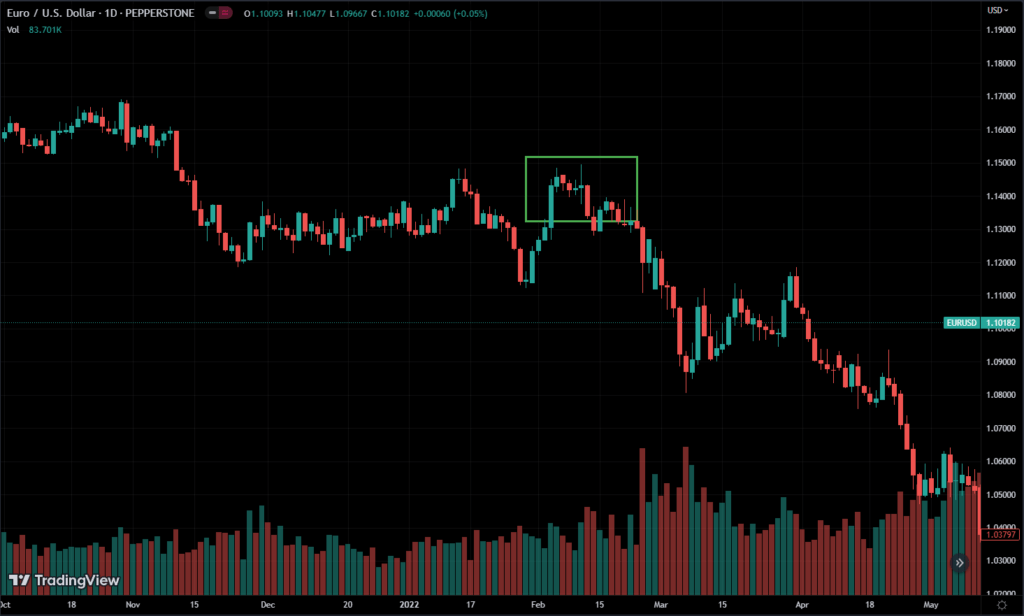
Candlesticks mean more when you put them together.
In this chart, there is a downtrend, followed by a Doji and a green bullish candle.
The first candle in the pattern is a long red candle, indicating that sellers are in control of the market. the second candle is a Doji, which opens and closes at the same price, with a small body and long shadows. the Doji represents uncertainty in the market and indicates that neither buyers nor sellers have control over the market. the third candle is a long green candle, indicating that buyers have taken control and pushed the price up. This confirms the reversal of the downtrend and suggests that a new uptrend may be starting.
Like any other technical analysis tool, it’s important to confirm the pattern with other indicators before making trading decisions.
Here. the market moves sideways, a red candle followed by a doji. If a market moving sideways then its mean, its more likely to break either up or down soon.
When a Doji appears on a candlestick chart, it represents a period of indecision in the market where neither buyers nor sellers have a clear advantage. However, a red candle followed the Doji, which suggests that sellers have gained control and have pushed the price down. This can indicate a potential downtrend in the market.
What are Bearish Harami / Bullish Harami?
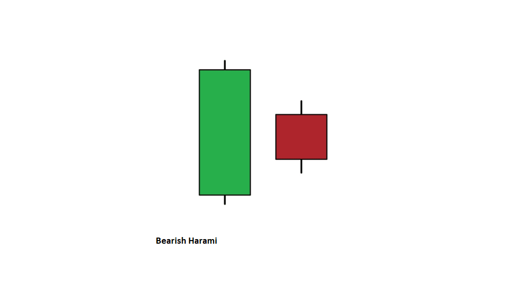
The first candle in the pattern is a long green candle, representing a bullish trend. The second candle is a small red candle, which opens within or above the body of the previous candle and closes below its open.
The red candle is contained within the body of the previous green candle, forming a pattern similar to a pregnant woman, hence the name “Harami,” which means pregnant in Japanese. nice to know right?
Suggests that the market’s sentiment is shifting from bullish to bearish, as the momentum/strength of buyers is not there anymore, sellers are starting to take control. which indicates a trend reversal.
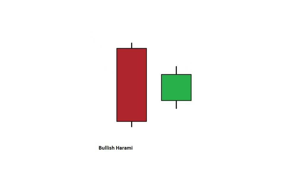
The first candle in the pattern is a long red candle, representing a bearish trend. The second candle is a small green candle, which opens within or below the previous candle’s close and closes above its open.
Suggests that the market’s sentiment is shifting from bearish to bullish, as the momentum of sellers is not there and buyers are starting to take over.
if you don’t understand these harami’s don’t worry, it will make more sense when you start working on charts more.
What are Engulfing Bullish / Engulfing Bearish?
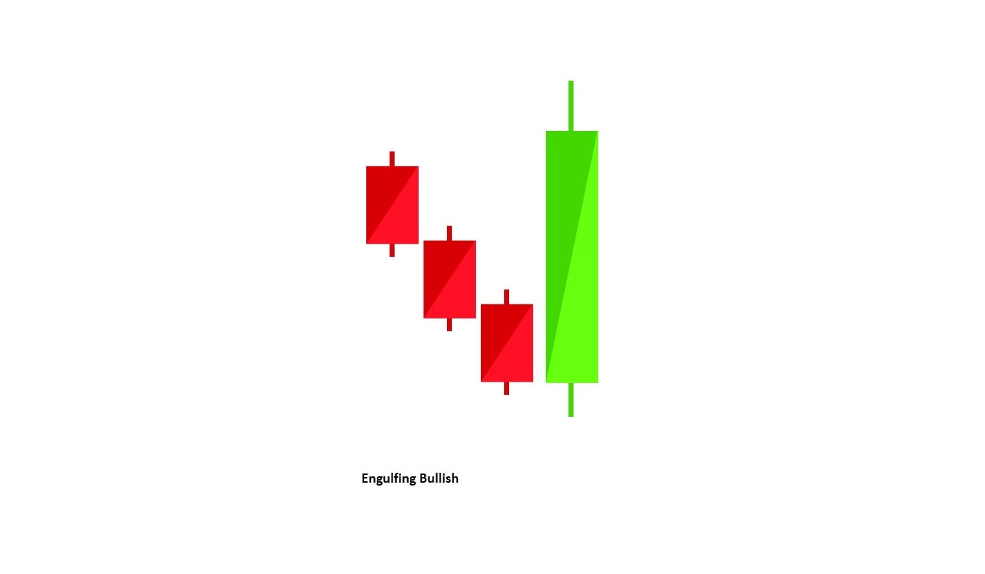
Engulfing bullish is a bullish reversal pattern in candlestick charting.
It is formed when a small bearish candlestick is followed by a larger bullish candlestick that “engulfs” the small bearish candlestick, i.e., the bullish candlestick’s body covers the entirety of the previous bearish candlestick’s body.
The engulfing bullish pattern is significant because it suggests that buyers have taken control of the market after a period of selling pressure.
It is often seen as a strong bullish signal, especially if it occurs after a downtrend or a period of consolidation.
Supply was higher than demand before. now demand is higher than supply
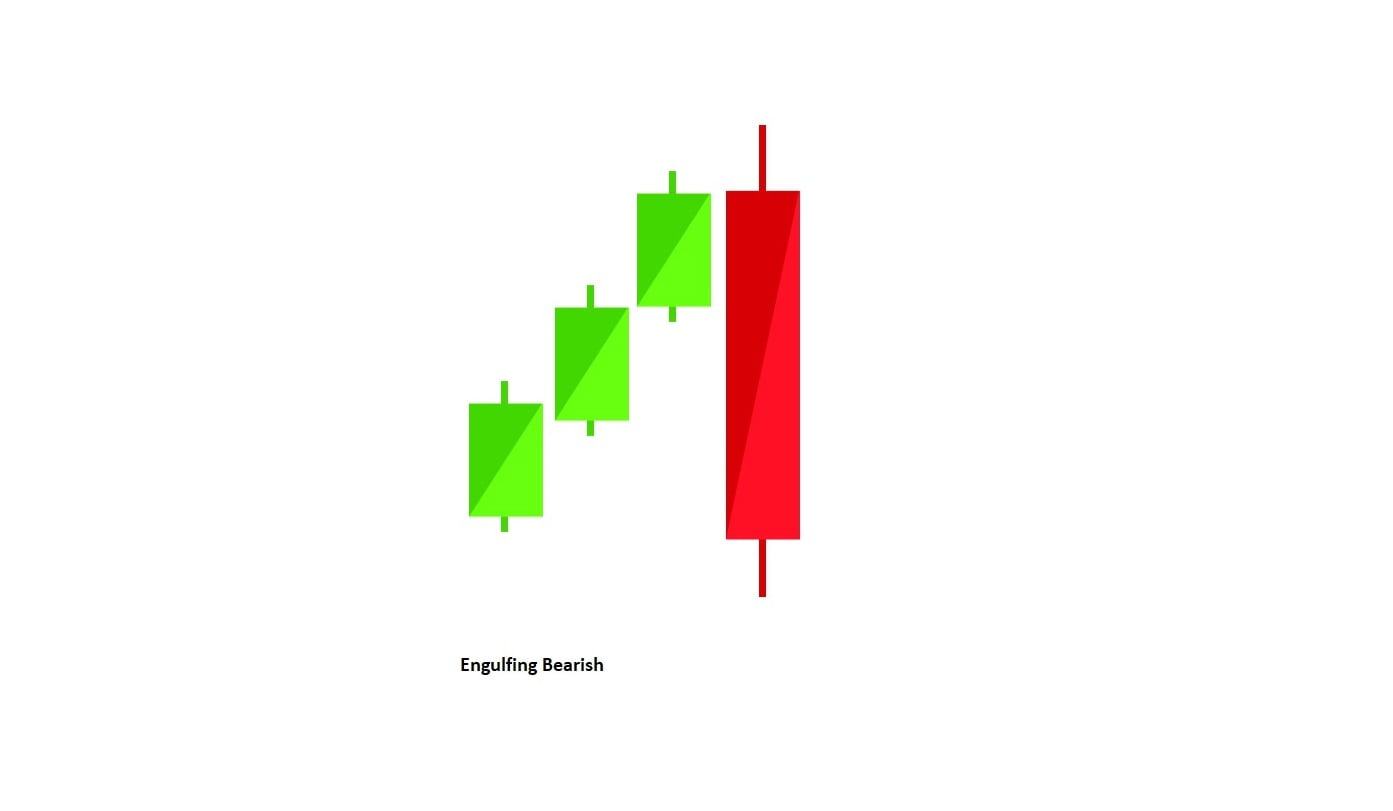
On the other hand, engulfing bearish is a bearish reversal pattern, It is formed when a small bullish candlestick is followed by a larger bearish candlestick that “engulfs” the small bullish candlestick.
It suggests that sellers have taken control of the market after a period of buying pressure. It is often seen as a strong bearish signal, especially if it occurs after an uptrend or a period of consolidation.
Demand was higher than supply. now supply is higher compared to demand.
Conclusion
Now get your hands dirty, try finding these patterns. The best charting software for this job is TradingView
These patterns are not trading strategies in themselves, as we cannot simply buy or sell based solely on their presence. Instead, we use these patterns to time the market effectively, which means entering and exiting positions at the most opportune times to achieve maximum profits.
Basically, if you already want to buy a stock. then these patterns help with buying at the right time.
I have discussed the supply and demand implications of each pattern, but I do not intend for you to memorize these patterns. Rather, my aim is for you to develop a deep understanding of how to interpret and read them effectively. so you can read the whole chart instead of patterns.
Again don’t try to memorize it. but understand it.