
To learn how to trade chart patterns, the first step is to understand what they are. Let’s dive into it.
What are Chart Patterns?
Chart patterns are visual representations of price movements in financial markets displayed on a price chart.
Chart patterns appear in different timeframes, from short-term minute charts to longer-term daily or even monthly charts.
Chart patterns are formations that can indicate whether prices will continue in the same direction or reverse. They’re important in technical analysis because historical patterns tend to happen again.
Some patterns from the past show a specific price move after they happen. We think these patterns are likely to happen again in the future, affecting prices similarly to before. So, history might repeat itself through these patterns.
These patterns happen on charts because people influence prices. When people trust these patterns and act on them, they place orders expecting the same movements as before, which then affect prices. When people believe in these patterns, they’re more likely to happen again. Basically, believing in these patterns makes them come true.
A chart shows how supply and demand have changed in the past. It gives a picture of how the price of something has moved over a certain period. Also, a chart tells the story of what an asset has been up to over time.
Out of all the patterns out there, it’s important to focus on avoiding less known information in trading. So, we’ll concentrate only on the patterns that are used a lot and are well understood, because they make sense logically.
What is the Head and Shoulders Pattern?
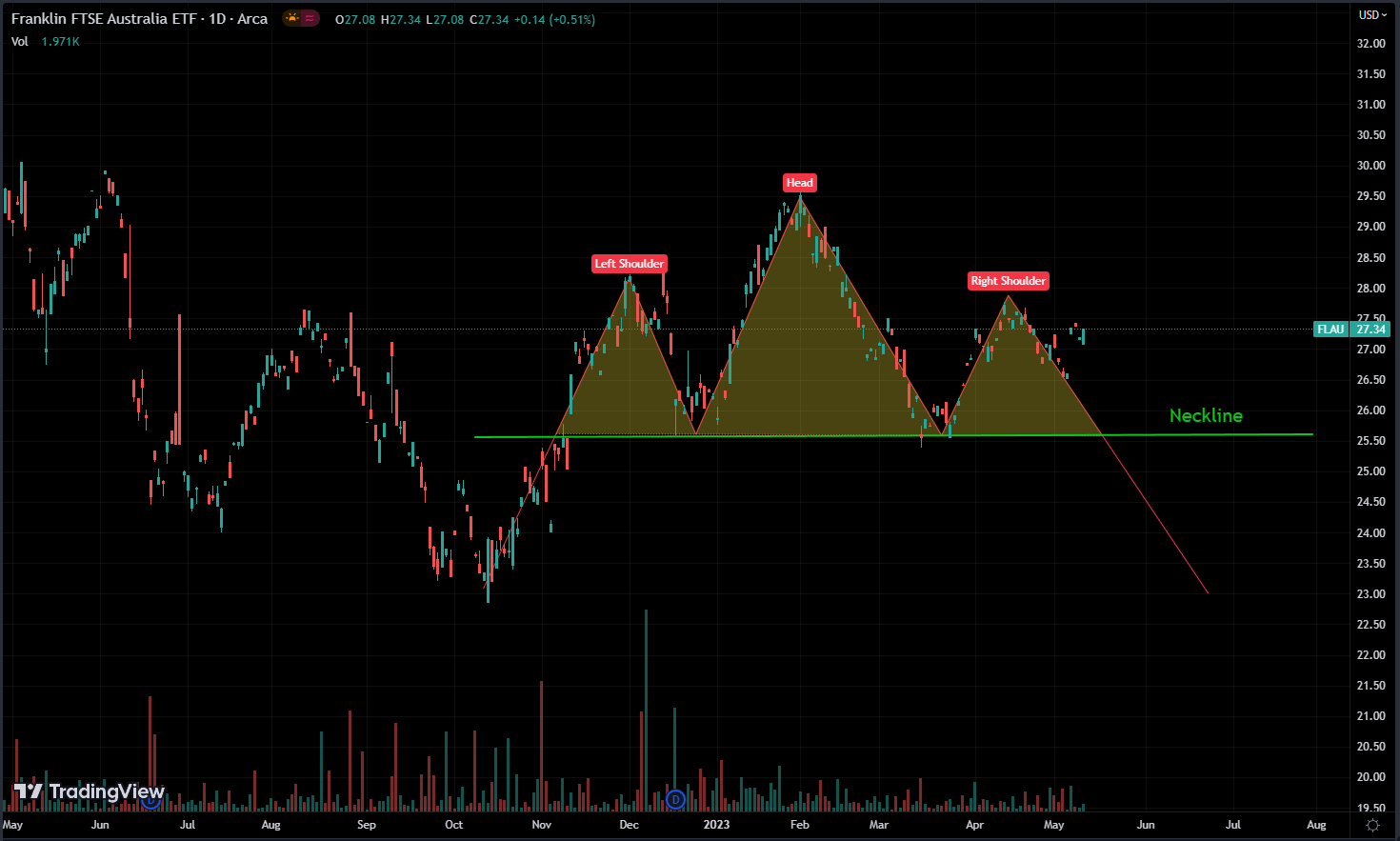
The pattern consists of three key components: a left shoulder, a head, and a right shoulder.
The left shoulder happens when the price of something goes up, then comes down a bit. Next, the price goes up again, making the head, usually higher than both shoulders. Finally, the right shoulder forms when the price goes up but doesn’t reach the same level as the head.
The main thing about the head and shoulders pattern is the neckline. It’s a line drawn straight across the lows of the left shoulder, head, and right shoulder. This line works as a support level.
The pattern suggests a reversal of an existing uptrend. When the price breaks below the neckline, it is considered a bearish signal and indicates that selling pressure has overcome buying pressure.
Traders often see this as a sign that the price might go down more. The distance from the head to the neckline can help figure out how far the price might drop next.
Conversely, an inverse head and shoulders pattern is a bullish reversal pattern that signals the end of a downtrend. In this pattern, the price forms three bottoms, with the head being the lowest point. A breakout above the neckline is seen as a bullish signal, indicating potential upward movement.
What makes chart patterns special is that they’ve proven to work well in the past, which has caught a lot of people’s attention. So, when these patterns show up, traders usually react the same way they did before, making the pattern work even better. It’s like a cycle where the pattern keeps reinforcing itself, kind of like how support and resistance levels work in trading.
Since chart patterns are things we can see happening on charts, it’s really important for us to pay attention to them, even if they don’t seem to make sense at first.
It’s good to look for really strong or easy-to-spot patterns because their success depends on a lot of people recognizing them. When these patterns are easy for more people to see, they’re more likely to do what we expect them to do.
Our goal isn’t to guess the price of a stock right away. Instead, we aim to guess what other people in the market might do, because it’s their actions that really change prices.
If you notice a pattern that nobody else sees, it’s not helpful. and you want to spot a pattern before others do, so you can make your move before they do.
Our goal is to get into a position early before big changes happen in supply or demand in the market.
In trading, making money depends on how likely something is to happen. It means guessing which way prices will go based on good information. Sometimes you’ll make mistakes, but the aim is to be right more often than wrong, so you can make money.
What is a Double / Multiple Tops Pattern?
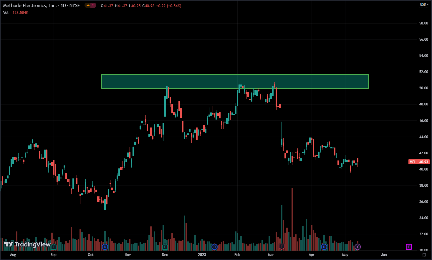
The double tops pattern occurs when an asset’s price reaches a significant high, retraces, and then rallies again to a similar high before experiencing a reversal.
This pattern shows two peaks, roughly at the same price, with a dip in between. The peaks act as resistance levels, where selling pressure keeps the price from going higher.
The multiple tops pattern, sometimes called triple tops or quadruple tops depending on how many peaks there are, is like a continuation of the double tops pattern. It’s when the price keeps hitting a high point but can’t break through a certain resistance level, making a flat pattern.
This pattern shows that buying power is getting weaker, and sellers might start to take over, possibly causing prices to drop.
Traders search for a reversal candlestick pattern at the top or peak, and they enter a position if they find one. We use both candlestick patterns and chart patterns together to make decisions.
There’s a fundamental reason why this pattern works, above everything else.
A double top is when a chart hits the same high price level twice or more and can’t break through it. That level acts as resistance for an asset. Since prices usually struggle to break through resistance, you expect the price to drop.
The reason for this price movement is that there’s a lot of supply at the resistance level. The reasons behind this high supply volume can be different, but what’s certain is that there’s a significant amount of supply at that level.
Double or multiple tops patterns are often more noticeable in intraday trading than on daily charts. That’s because, in the short term, the reasons behind these patterns are likely to stay the same compared to longer timeframes.
That doesn’t mean daily charts don’t work; a lot of people use them, so both intraday and daily chart patterns can be effective.
Chart patterns can appear in both short-term and long-term timeframes, and they give us details about supply and demand levels. So, they can be useful no matter which timeframe you’re looking at.
Each time a resistance level isn’t broken, it gets stronger. And the reason why a stock price moves in a certain direction is because people think it’ll move that way.
What is a Double / Multiple Bottoms Pattern?

It’s the same theory as Tops, but this time it’s about support instead of resistance. It’s about demand instead of supply.
The double bottom pattern happens when the price of an asset hits a big low, bounces back up, and then goes down again to hit a similar low before changing direction.
This pattern shows two clear low points, roughly at the same price, with a recovery in price between them. These low points act as support levels, where buying pressure stops the price from dropping more.
The multiple bottoms pattern, like the double bottoms pattern, shows a series of low prices that can’t break through a certain support level, making a flat pattern.
This pattern indicates that the selling pressure is getting weaker, and buyers might start to take over, possibly causing prices to go up.
Similar to tops, traders search for a reversal candlestick pattern at support to enter a position.
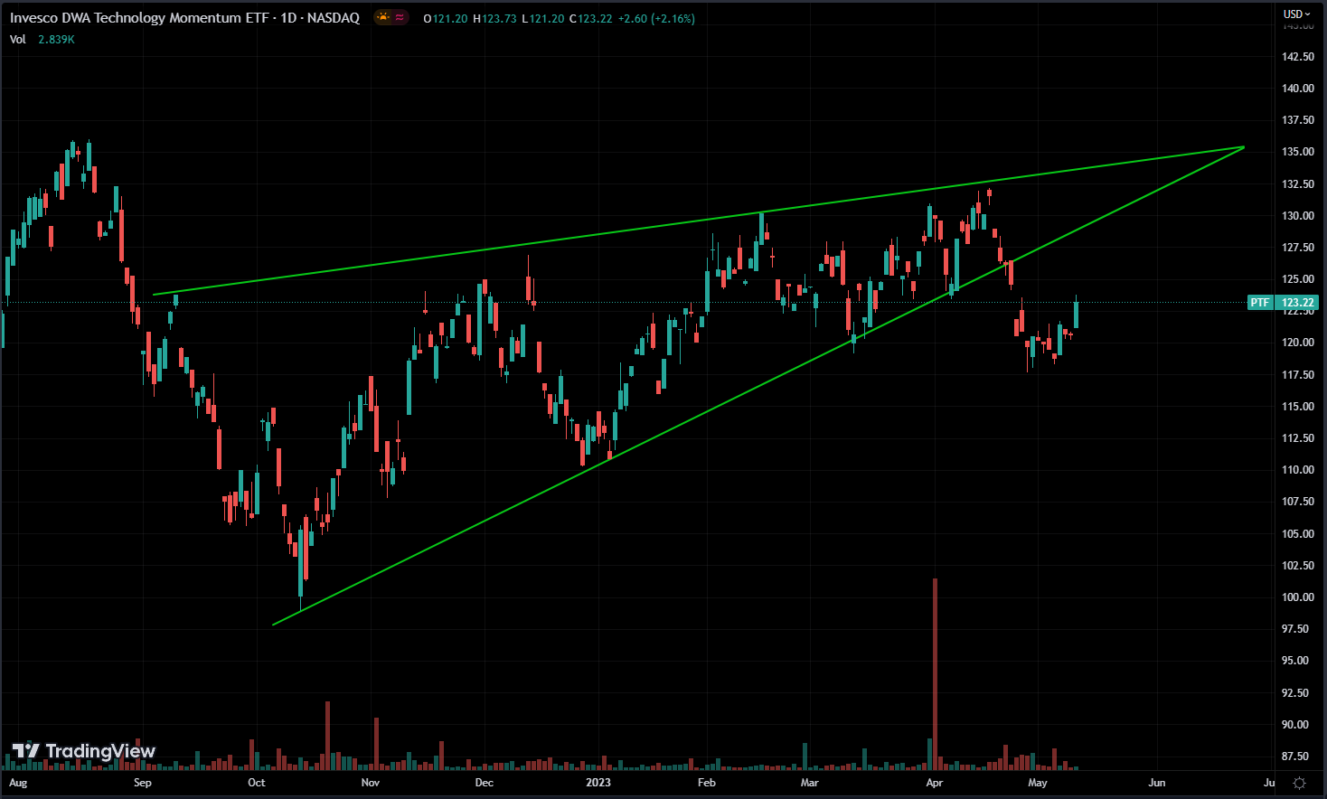
What is an Ascending Triangle Pattern?
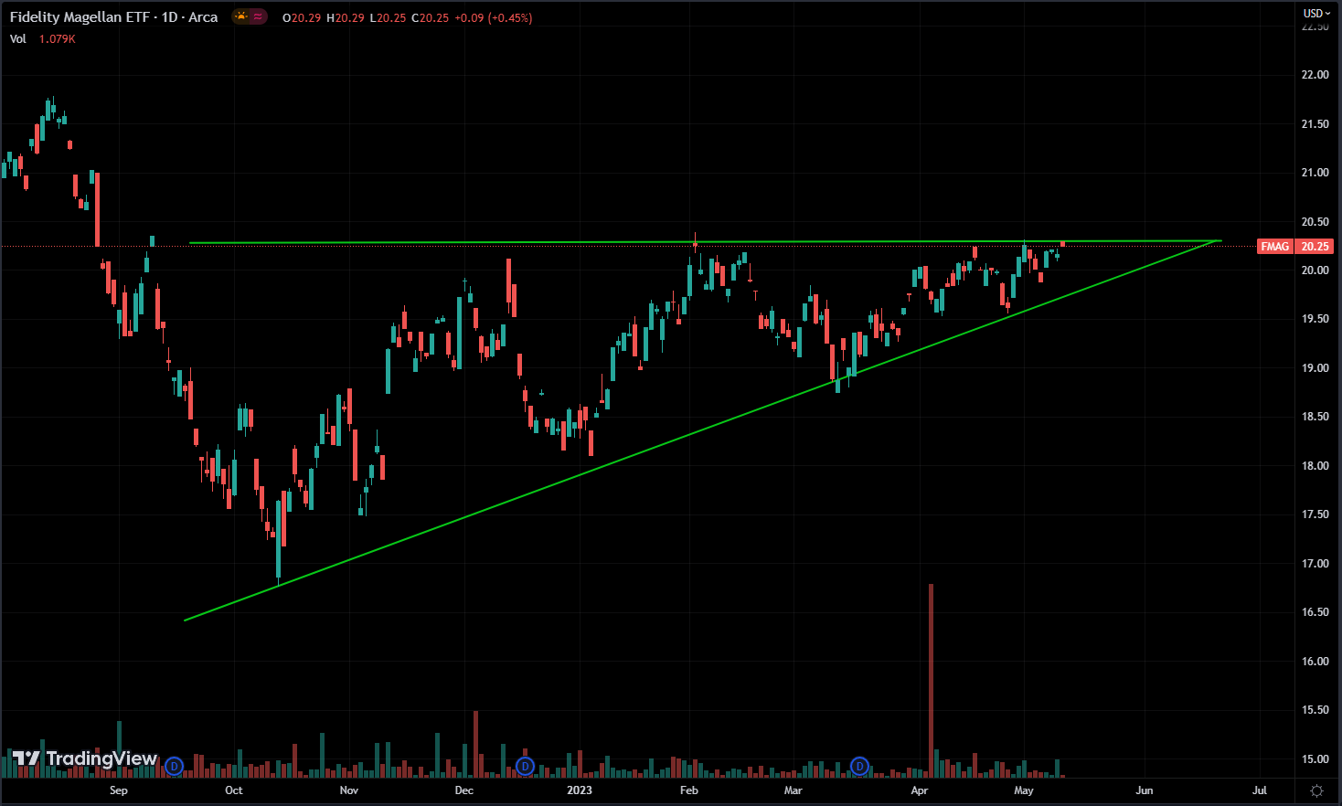
The ascending triangle pattern is often seen on charts. It happens when the price of an asset moves between a horizontal resistance level and a rising trendline, forming a triangle shape.
This pattern shows higher lows over time, signaling more buying interest, along with a flat resistance level where selling pressure holds the price back from rising further.
The rising trendline connects the higher lows, forming the ascending triangle pattern.
Traders see the ascending triangle pattern as a bullish sign of continued upward movement. It means that buying pressure is slowly winning over selling pressure, hinting at a possible breakout to higher prices.
This pattern usually means there’s a time of consolidation before the price makes a clear upward move.
The breakout from the pattern happens when the price breaks above the flat resistance level. Usually, this breakout comes with more trading volume, showing how strong the upward move is.
It’s important to remember that a breakout from the ascending triangle pattern can go either way. But usually, there’s a higher chance of a breakout above the resistance level. That’s because buyers usually get more aggressive over time, leading to a bullish breakout.
Traders commonly use the distance between the initial low and the horizontal resistance level to estimate the potential target for the upward move.
When the breakout happens, traders quickly get into positions. You have to wait until the breakout because we can’t be sure in which direction it will break.
If the price breaks the resistance, traders who bet against the asset will need to buy it back to cover their losses. This buying pushes the price up, increasing demand for that asset once the breakout occurs.
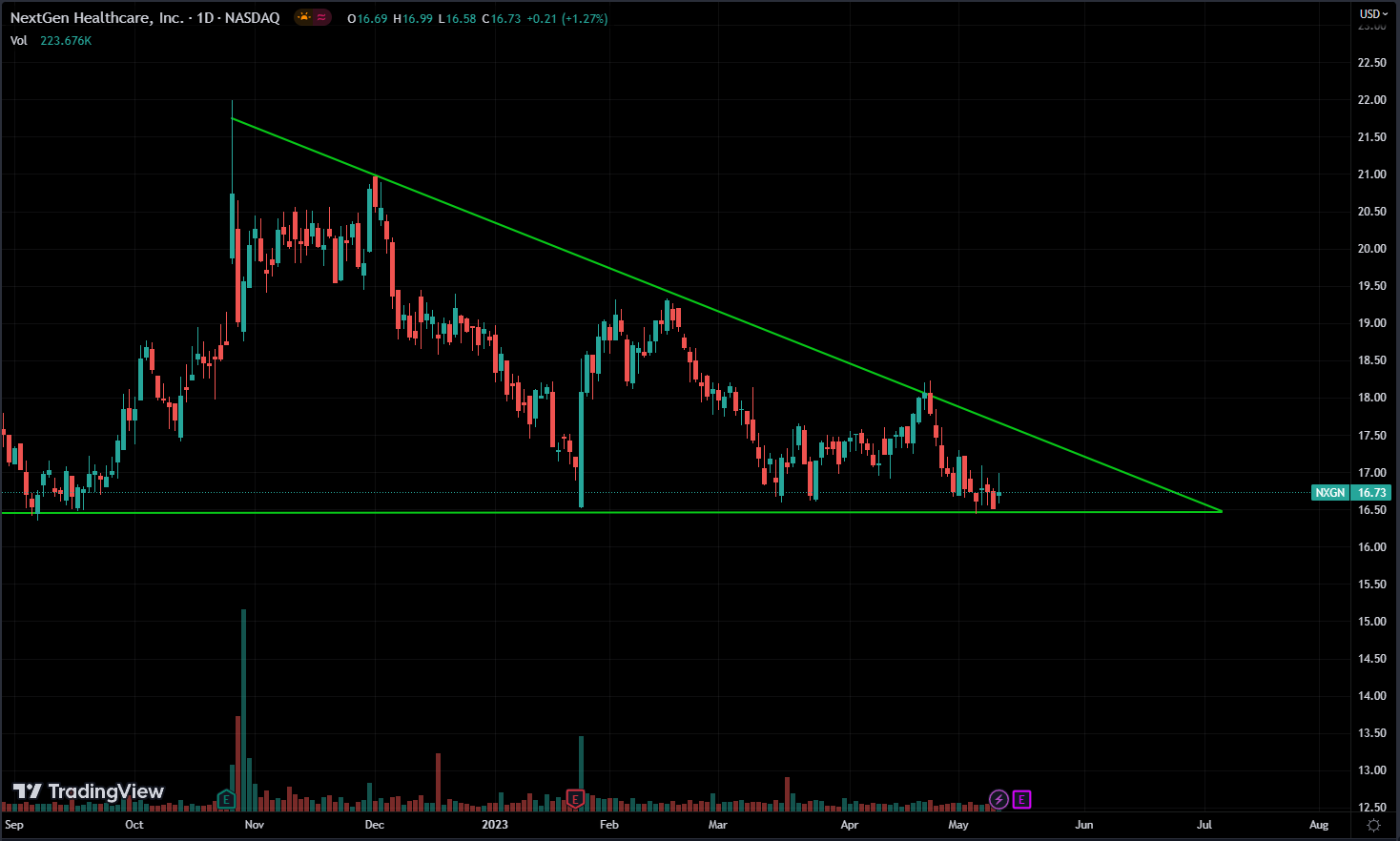
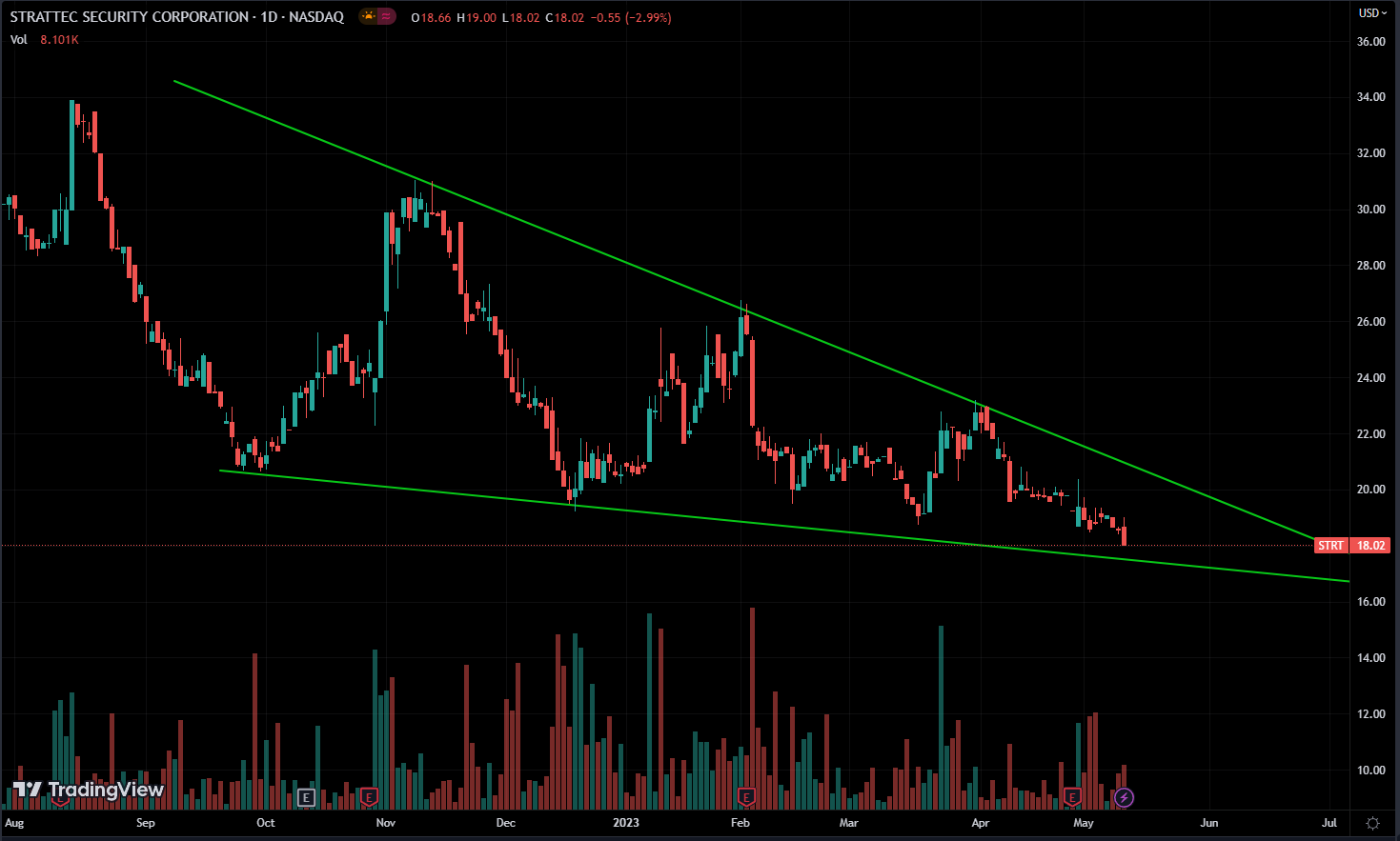
What is a Descending Triangle Pattern?
Similar to the ascending triangle, but this time sellers are more aggressive than buyers. Instead of a resistance, there’s a support level.
It forms when the price of an asset moves between a downward sloping trendline and a flat support level.
This pattern shows lower highs over time, suggesting more selling pressure, along with a flat support level where buying pressure stops the price from dropping further.
The downward sloping trendline connects the lower highs, forming the descending triangle pattern.
Traders see the descending triangle pattern as a bearish sign of continued downward movement.
It means that selling pressure is slowly winning over buying pressure, hinting at a possible breakout to lower prices. The pattern usually shows a time of consolidation before the price makes a clear downward move.
The breakout from the pattern happens when the price breaks below the flat support level. As before, this breakout usually comes with more trading volume, confirming the strength of the downward move.
Just like with the ascending triangle, the breakout in a descending triangle could go either way, so it’s best to wait until the breakout to enter a position.
Wedge Patterns
The wedge chart pattern is another common pattern seen in financial markets. It’s recognized by trendlines coming together, either sloping up or down, forming a wedge shape.
Unlike ascending and descending triangles, we can’t be as certain about where the breakout might happen with wedges.
There are two types of wedge patterns:
What is a Falling Wedge Pattern?
In this pattern, the trendlines slope downward, but the lower one has a steeper slope than the upper one.
The falling wedge pattern suggests a potential bullish reversal, indicating that the selling pressure is gradually diminishing. Traders often interpret this pattern as a sign of an impending breakout to the upside.
What is a Rising Wedge Pattern?
Unlike the falling wedge, the rising wedge pattern has trendlines that slope upward, with the upper trendline having a steeper slope than the lower one.
The rising wedge pattern points to a potential bearish turnaround, indicating that buying pressure is weakening. Traders usually see this pattern as a signal that a breakout to lower prices might be on the way.
Both types of wedge patterns are known for reduced price volatility between the converging trendlines. This narrowing of the price range is often viewed as a time of uncertainty and may come before major price shifts.
Traders often expect a breakout from the wedge pattern. This happens when the price moves past one of the trendlines, usually with more trading volume. Whether the breakout goes up or down decides the possible future price trend.
It’s essential to remember that not all wedge patterns lead to breakouts, and sometimes false breakouts happen. This means the price might break out of the range but then go back inside.
Before we wrap up, there are a few other patterns worth mentioning, like the cup and handle and rounding bottom. I won’t go into detail here because I don’t find them as useful as the ones mentioned earlier. Plus, trading involves more than just chart patterns.
Now, check finviz for these patterns, and use your platform to try to find them by yourself. Keep practicing identifying these patterns.
Conclusion
You may have noticed that these patterns share some similarities with each other. That’s why I’m not fond of memorizing their names. Instead, I want you to understand them like candlestick patterns—focus on what these patterns or price movements reveal about supply and demand and the behaviors of other participants in the market.